This prompt (Flat Illustration Infographic Prompt) will help you generate a detailed infographic with a top vector illustration, visually representing all data and information as much as possible.
Design a high-quality, vertically composed editorial-style infographic.
- Objective: To visually summarize the core data, comparative information, and key attributes of the topic.
- Illustration Style: Flat Vector Illustration. Must include clear, uniformly thick black monoline/strokes. Coloring should be simple, using only minimal shadows; gradients or 3D rendering effects are strictly prohibited.
- Composition: Panoramic horizontal composition, occupying the top 1/3 of the page.
- Line Work: Must use uniformly thick black monoline/uniform strokes. All objects (buildings, plants, clouds) must have closed black outlines, similar to coloring book line art. Line ends should be rounded, avoiding sharp angles.
- Geometric Simplification: Simplify complex objects into basic geometric shapes. For example, trees are simplified to lollipop shapes or triangles, buildings to simple rectangular blocks, and windows to neat small square grids. Avoid realistic details; aim for a cute, “toy model” feel.
- more …
The information is extensive, generating at 4K resolution is recommended. The prompt is quite lengthy. Please read it carefully and patiently, and feel free to adjust it as needed based on your specific requirements.
Prompt For Flat Illustration Infographic Prompt
## Roles and Tasks
Design a high-quality, vertically composed editorial-style infographic.
Objective: To visually summarize the core data, comparative information, and key attributes of the topic.
## Visual Style & Art Direction
- Illustration Style: Flat Vector Illustration. Must include clear, uniformly thick black monoline/strokes. Coloring should be simple, using only minimal shadows; gradients or 3D rendering effects are strictly prohibited.
- Composition: Panoramic horizontal composition, occupying the top 1/3 of the page.
- Line Work: Must use uniformly thick black monoline/uniform strokes. All objects (buildings, plants, clouds) must have closed black outlines, similar to coloring book line art. Line ends should be rounded, avoiding sharp angles.
- Geometric Simplification: Simplify complex objects into basic geometric shapes. For example, trees are simplified to lollipop shapes or triangles, buildings to simple rectangular blocks, and windows to neat small square grids. Avoid realistic details; aim for a cute, "toy model" feel.
- Space and Perspective: Use a 2.5D perspective (similar to isometric projection, but more flexible) with a level or slightly overhead view. Use layer occlusion to create depth; avoid atmospheric perspective (i.e., don't blur or fade distant views), and ensure all layers have consistent sharpness.
- Decorative Elements: Add decorative geometric elements to blank spaces, such as radiating lines (representing sunlight or energy), pill-shaped clouds, or simple dots and stars, to balance the visual density of the image.
- Color Scheme: Retro and soft tones.
- Background: Beige/cream (off-white) paper-textured background.
- Accent Colors: Coral Red, Mint Green, Mustard Yellow, Burnt Orange, and Rock Blue.
- Typography:
- Main Heading: Large, bold Retro Serif font, conveying authority and elegance.
- Subheading: All-caps sans-serif font within a rectangular color block.
- Body Text: Clear and legible geometric sans-serif font.
## Layout and Composition Structure
1. Top: The Header
- Typography: Place the title (e.g., "Everything About..." or "Core Analysis...") in the top left corner, and the large theme name ([Theme Name]) in the top right corner.
- Hero Illustration: Create a panoramic illustration spanning the entire page, showcasing the core scene or appearance of the [Theme]. The style should be geometric, with outlines, and flat.
2. Middle Section: Comparison and Segmentation (The Split Section)
- Structure: Divide the screen horizontally into two modules (or upper and lower layers).
- Content: Used to compare two sub-themes (e.g., Model A vs. Model B, Advantages vs. Disadvantages, Past vs. Present).
- Elements: Each module should contain a representative illustrated building or object, along with text boxes for key parameters (e.g., price, size, core functions).
3. Bottom Section: Data Visualization Grid (Data & Metrics)
- Left Side (Macro Data): Vertically arranged circular icons/dashboards. Use pie charts to display percentage data (e.g., growth rate, satisfaction rate, percentage), with values labeled in large font.
- Right Side (Micro Details): Dense but well-organized grid layout. Use cute small vector icons (with outlines) to represent specific items (e.g., components, accessories, unit costs). Each icon should be accompanied by a specific value or brief description.
## Content Generation Requirements
- Retrieve and organize realistic or reasonable detailed data based on the [Theme].
- Ensure all text is clear and legible, strictly adhering to visual hierarchy (heading > subheading > body text).
- Use bold black lines to clearly distinguish different content sections.
## The content to be generated is:
- {Please enter text here.}Example
Text
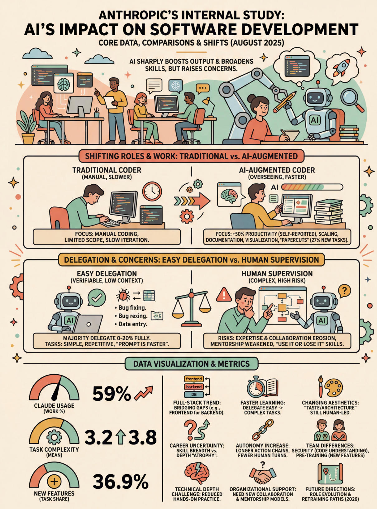
Anthropic’s data report on the usage of Claude Code within their company.Picture

via: @op7418
Use this prompt to generate your version? Share in the comments!
Explore more? View the Writing & Content Creation category or Nano Banana series.
Internal link:
Annotate Your Paper With Doodles
Create Four Seasons in One Image