Brand teams and presentation designers need a brand identity guideline board prompt that can keep logos, packaging, touchpoints, and mockup hierarchy on one clean system sheet. This version preserves the structured white-grid logic from the Domino’s and PlayStation examples while letting you redirect the board toward FMCG, gaming, retail, or e-commerce brand systems without collapsing into moodboard clutter.
Image Examples


Strategic Deployment Guide
Model fit: ChatGPT image generation is strongest for structured presentation boards with many branded modules, object families, and mockup zones; Gemini is useful for alternate board emphasis and faster variant sweeps. Keep the hero brand zone, module grid, and category labels fixed, then swap only the brand, asset families, material system, and touchpoint emphasis.
Brand Identity Guideline Board Prompt Code
ROLE:
Act as a world-class global branding agency creating a premium brand identity guideline board or packaging design system guide for [brand].

CORE DELIVERABLE:
Build one polished white-background presentation board in a clean modular grid. The board must look like a real agency review sheet, not a chaotic moodboard.

HERO SYSTEM:
Create a top hero section with [logo or wordmark], [tagline], [brand pillars], and one [hero product, packaging asset, or in-context brand object].

GRID MODULES:
Organize the rest of the board into clearly labeled presentation modules:
- color palette and grayscale support
- typography hierarchy
- logo variations
- brand patterns or supporting shapes
- iconography
- [packaging or merchandise mockups]
- print and stationery
- digital interfaces
- social or retail communication
- [lifestyle or retail environment]

SCENE LOGIC:
Treat each module as part of one unified presentation board. Keep object scale, margins, shadows, and label zones consistent so the sheet reads like one brand system instead of disconnected product renders.

VARIABLE CONTROL:
- brand: [brand]
- identity tone: [bold / premium / playful / futuristic / family-trusted]
- official palette: [brand colors]
- packaging families: [boxes / pouches / apparel / cups / bags / stationery / hardware packs]
- finish treatments: [matte / gloss / emboss / foil / spot UV / soft touch]
- environment ending: [store shelf / delivery scene / office desk / retail environment / lifestyle scene]

GRAPHIC DIRECTION:
Use photorealistic mockups, clean module spacing, modern sans-serif type, professional label hierarchy, and studio presentation lighting. Make every board zone feel premium and readable.

ADVANCED BOARD OPTIONS:
Include [exploded packaging views], [construction diagrams], [limited-edition variants], [sustainability icons], or [retail shelf presentations] only when they fit the brand emphasis.

NEGATIVE PROMPT:
No cluttered collage chaos, no inconsistent mockup lighting, no random product angles, no weak typography, no unreadable labels, no fake brand palette drift, no generic corporate board with empty filler modules.

OUTPUT FORMAT:
Return one ultra-clean premium presentation board with a strong hero zone, disciplined module hierarchy, realistic mockups, and a finished agency-grade brand system surface.
Why This Framework Functions
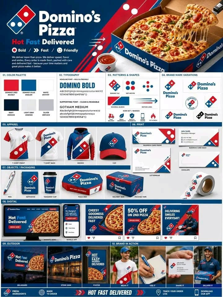
The framework works because it fixes the board architecture before it asks for brand styling. That order matters. Once the hero zone, module grid, label hierarchy, and mockup categories are stabilized, the model can swap brand variables without breaking the whole sheet. The Domino’s version expands into full touchpoint branding, while the PlayStation version compresses the same structure around packaging, finishes, and retail display.
Implementation Steps
- Lock the brand, board emphasis, and hero asset first so the model knows whether this is a broad identity board or a packaging-system-heavy guide.
- Choose 6-10 module families before generation instead of letting the model invent random filler sections.
- Specify the material and mockup families separately, because boxes, apparel, stationery, and digital UI all need different rendering behavior.
- Run one version with more touchpoint breadth and one with stronger packaging depth, then keep the board that matches the real presentation goal.
- After generation, do one post-render layout repair pass for module spacing, label alignment, duplicate mockups, and any crowded zones in the lower half of the sheet.
- Manually rebuild logos, legal copy, barcodes, recycling marks, or technical packaging text that must be accurate before any real presentation use.
Application Scenarios
- Client pitch boards: agencies exploring a full identity system for food, retail, consumer electronics, or lifestyle brands before formal deck production.
- Packaging design exploration: teams testing how one brand language extends across rigid boxes, accessory packs, labels, shopping bags, and shelf display.
- E-commerce and retail system planning: designers mapping how the same identity behaves across app screens, social posts, unboxing assets, and in-store touchpoints.
- Internal brand guideline drafts: startups and in-house teams creating a visual reference board before a full manual or packaging rollout is commissioned.
Why This Prompt Works
The prompt is strong because it does not ask for “branding” in the abstract. It asks for a specific deliverable: one modular board that must hold hierarchy, labels, color logic, mockups, finishes, and end-touchpoint scenes in the same system. That pushes the model toward presentation discipline instead of generic product renders placed next to random swatches.
Troubleshooting & Optimization
- The board feels like a moodboard: append strict modular grid, clearly labeled sections, presentation-board spacing, and consistent margins across all modules.
- The mockups look disconnected: append all assets share one lighting language, one camera family, and one coordinated brand presentation system.
- The lower modules become crowded: append clean negative space, fewer duplicated mockups, readable labels, and balanced bottom-row density.
- Brand text becomes unusable: keep the visual system and manually rebuild any exact logos, claims, barcodes, or legal labeling afterward.
FAQ
- Q: What is a brand identity guideline board prompt used for?
A: It is used to build one structured visual board that shows how a brand system extends across logo use, colors, typography, packaging, merchandise, digital touchpoints, and retail presentation. - Q: Can this handle both full identity boards and packaging-only guides?
A: Yes. The same board architecture can broaden into full brand touchpoints like the Domino’s example or narrow into packaging-system depth like the PlayStation example. - Q: What usually still needs manual correction?
A: Exact logo fidelity, legal copy, barcode details, recycling marks, and precise packaging engineering labels usually need manual cleanup before the board can be used in a real presentation. - Q: Is this better for pitch decks or final production files?
A: It is strongest for concept boards, direction setting, and client review visuals. Treat it as a high-end presentation draft, not a replacement for production-ready brand documentation.
Use this prompt to generate your version? Share in the comments or on Twitter!
Explore more? View the Image & Design category.
I hope you found this brand identity guideline board prompt helpful.
Follow me @bigprompt for more.
Like/Repost if you can this prompt.
Juice Advertising Poster Prompt: Pack-Led Fruit Splash Campaigns
TV Show Pixar-Style Poster Prompt: Animated One-Sheet Reimagining
ChatGPT Marketing Design Prompts That Sharpen Fast Campaign Assets
ChatGPT Design Prompts That Clarify Brand Systems and UX Work
Claude Book Publishing Prompts That Shape Cover, Launch, and Revenue Plans
Big Prompt Hub Review
This prompt is strongest when a brand team needs one disciplined presentation board instead of a loose set of unrelated mockups. The stable hero zone, modular category layout, and touchpoint-based structure make it reusable across food, retail, and consumer-tech brands. Its main weakness is text fidelity: exact logos, barcodes, claims, and engineering callouts can drift fast, so treat the output as a premium concept board and finish all sensitive details manually.
Leave a Reply
You must be logged in to post a comment.