
A cultural event poster must give the title priority while keeping schedule, place, and supporting attractions easy to scan for festival producers, independent cinemas, market organizers, and community arts teams. This studio kit turns that brief into a handmade torn-paper system rather than a polished generic flyer.
Image Examples
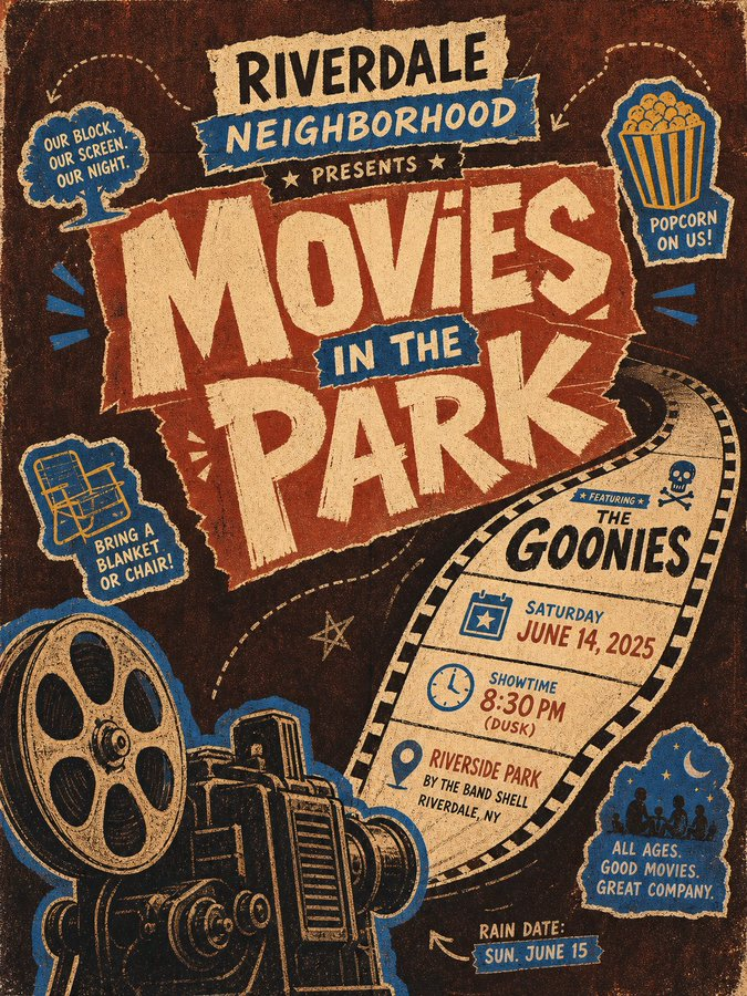
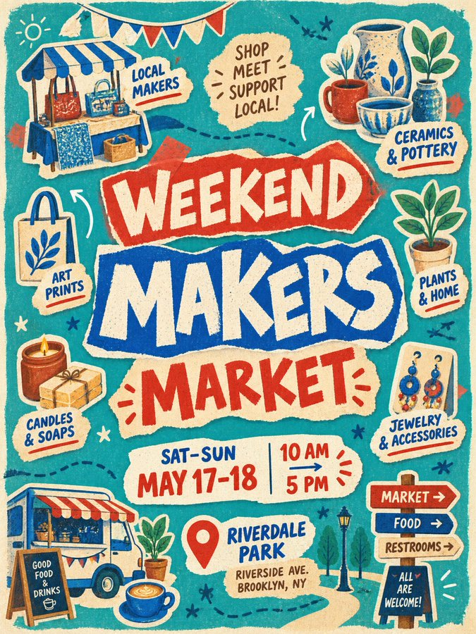
Strategic Deployment Guide
Model fit: ChatGPT image generation is the preferred first pass for this layered poster composition. Use a layout editor as the typography fallback: preserve the generated collage, then rebuild the event title, date, time, and location before publishing.
Cultural Event Poster Prompt Code
EVENT IDENTITY AND DATA:
Create an urban cultural event poster for [event title]. Use only verified [event data: date, time, venue, and location]. Make the event title the immediate visual anchor: huge, centered, split across staggered lines, and constructed from irregularly layered fluorescent torn-paper blocks. Combine rough brush lettering with paper-cut forms so the words read as hand-printed graphic shapes rather than orderly typesetting. Use heavy strokes, ragged broken edges, exaggerated corners, uneven counters, and slight local misregistration.

LAYOUT AND INFORMATION SYSTEM:
Build a loose circular scene around the title while keeping a clearly guided reading path. Distribute several blue-and-white outlined hand-drawn sticker badges for [badge subjects and small illustrations]. Each badge must connect one theme-related illustration, location marker, or symbol to a short white label. Vary badge size, tilt, and direction so the pieces feel casually pasted onto paper, but keep their relationship to the event clear. Give the badge subjects and labels a shared vivid-blue outer contour and yellow fill. Use [layout and output aspect ratio]. Keep the central title dominant, place secondary modules around it with rhythm and breathing room, and prevent any badge or label from becoming a competing headline.

MATERIALS AND BACKGROUND:
Use a warm fibrous [paper material and background surface]. Build a large brown-umber field that retains visible paper grain, impressions, small color variations, and bleeding print edges. Organize open areas with dark-brown hand-drawn dotted lines, arcs, arrows, and a few English geometric letterforms. Keep those marks sparse enough to guide the eye without challenging the main message.

COLOR AND PRINT STYLE:
Lock the main colors to [style palette]. Use flat fills, limited color overlap, and consistent cross-element strokes. Give every graphic, word, sticker, and background element slightly unstable handmade outlines, varied stroke weights, localized wear, screen-print misregistration, and imperfect making traces. Preserve the same collage, hand-drawing, screen-printing, and aged-paper logic across scene variations.

PRODUCTION FORMAT:
Deliver [output format and resolution]. Keep the title legible at the intended viewing size, preserve safe outer margins, and make event data readable after the final crop. Maintain a clear hierarchy: title first, essential event facts second, illustrated badge details third.

NEGATIVE CONSTRAINTS:
No modern gradients, glass effects, excessively polished digital shadows, generic corporate flyer layout, random unreadable text, clean vector-perfect outlines, unrelated sticker subjects, excessive color expansion, or supporting labels that compete with the main title. Do not erase paper fibers, bleeding edges, local wear, or screen-print misregistration.
Implementation Steps
- Lock factual copy: write the final event title, date, time, venue, address, and rain-date or accessibility note before generation.
- Map badge subjects: choose three to six event-specific objects and pair each with one short label; remove any badge that repeats information.
- Control hierarchy: make the torn-paper title occupy the greatest visual weight, then place the event-data module and badges around it without forming a second headline.
- Test the real crop: preview the poster at its final portrait or square ratio and at a small social-card size; enlarge essential text before export.
- Finish with layout repair: rebuild public-facing copy as vector typography in Figma or Illustrator, apply margin control, and run print calibration before export.
Application Scenarios
- Outdoor cinema campaign: create an A3 park poster and Instagram post with film, showtime, venue, and rain-date badges.
- Retail marketplace launch: promote makers, ceramics, food, and wayfinding in a portrait poster plus a square social post.
- Gallery brand campaign: announce an opening with artist, date, venue, transit, and accessibility stickers for a window poster and email newsletter.
- Community festival campaign: package workshops, music, food, and location details into a neighborhood poster and event-page asset.
Why This Prompt Works
The system works because the oversized torn-paper title anchors the hierarchy before viewers reach event logistics. The circular badge layout separates secondary facts into recognizable modules, while the shared blue contour and yellow fill preserves a visual relationship across words and illustrations. Limiting the palette and repeating worn paper edges prevents the varied badge angles from becoming visual noise.
Troubleshooting & Optimization
- If the title is too neat: append “ragged paper-cut counters, uneven baseline, visible screen-print misregistration.”
- If badges overpower the event: replace “large badges” with “small peripheral badges; central title occupies most visual weight.”
- If the palette drifts: append “flat ochre brown, bright yellow, vivid blue, warm off-white only; no gradients.”
FAQ
- Q: How do I make a cultural event poster with torn-paper typography?
A: Put the event title in the largest torn-paper blocks, then move date, location, and themed objects into smaller sticker badges. - Q: What event details should I prepare before generating?
A: Verify the title, date, time, venue, address, essential accessibility note, and any rain-date information first. - Q: How do I fix unreadable AI poster text?
A: Keep generated artwork as the base, then rebuild public-facing copy in a layout editor before publishing.
Adapt this prompt to your verified event brief, then check all public information before distribution.
Explore Image & Design and Prompt Engineering Guides.
Follow @bigprompt for more prompts and workflow systems.
Related creative routes:
Build a reference-led page with the Manga Page Prompt
Choose a hand-drawn illustration direction with the Hand-Drawn Styles Skill
Compare destination layouts in the Travel Poster Prompt Collection
Create layered paper depth with the Paper-Cut Travel Diorama Prompt
Structure a commercial poster with the Food Product Ad Prompt
Big Prompt Hub Review
This template is valuable when an event needs a visible handmade voice, a disciplined information hierarchy, and reusable visual logic across print and social assets. Its strongest control is the relationship between one dominant torn-paper title and smaller illustrated information badges. It does not make event details accurate or guarantee legibility at every output size, so final typography, crop, contrast, and accessibility remain human editorial checks.