
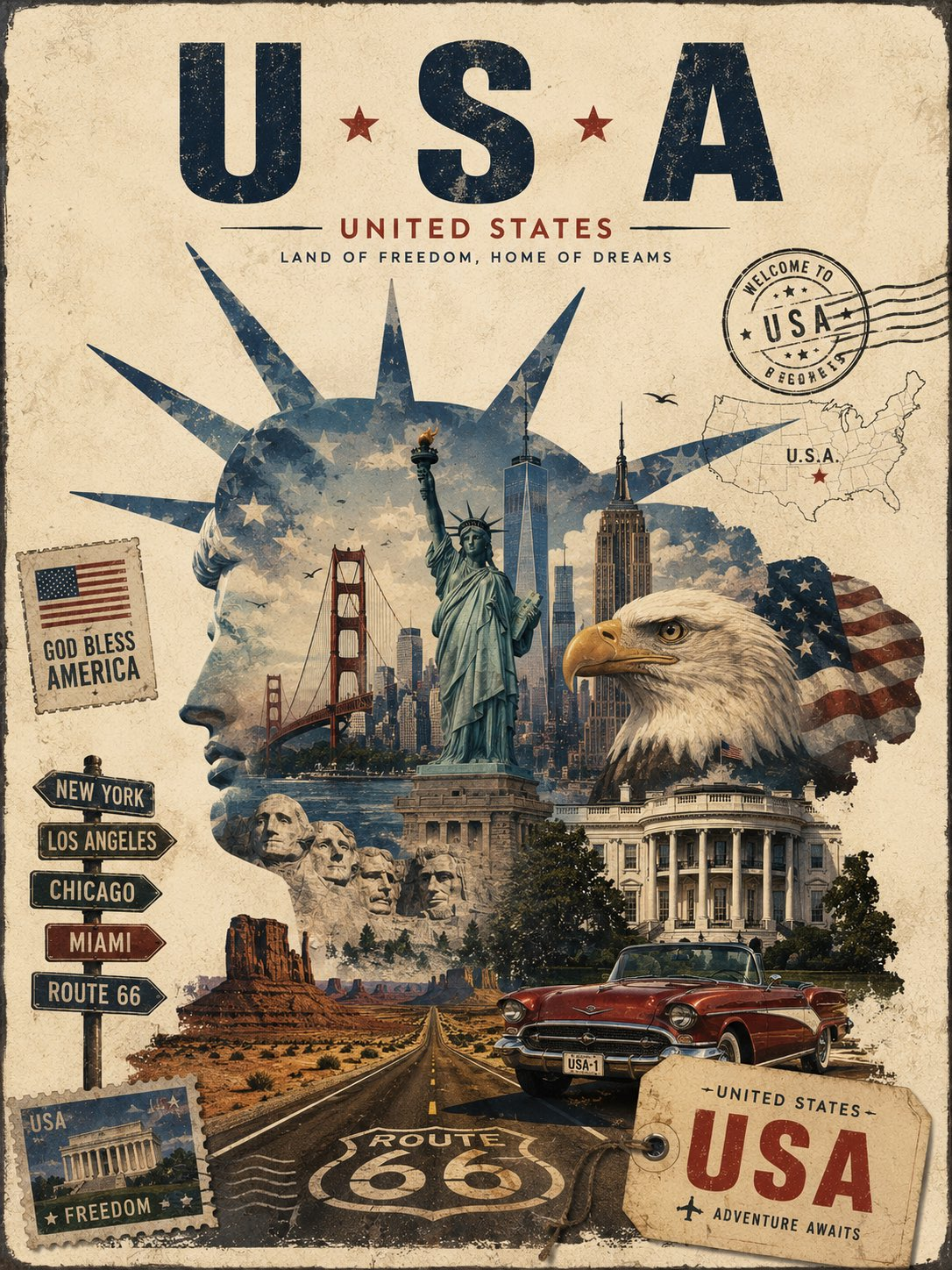
A vintage travel collage poster prompt gives designers a reusable way to turn a destination into a collectible editorial composition instead of a generic skyline. It keeps the city, country, landmark, and slogan editable while preserving the visual logic that makes the result feel like a printed travel artifact: a landmark-shaped frame, layered destination scenes, small paper ephemera, and a grounded local-transport foreground.
Image Examples


Strategic Deployment Guide
Model fit: Use an image model that can follow layered composition, readable display typography, and print-texture direction in one pass. Keep the four bracketed variables precise, then review whether the landmark silhouette still reads before you iterate. If lettering is unstable, generate the artwork first and add final display type in a layout tool; the city, country, and slogan remain the brief, not fixed example content.
Best use: Start with a destination whose landmark or cultural symbol is recognizable in profile. Treat the collage as a hierarchy: landmark frame first, destination scenes second, paper ephemera third, and one local vehicle or transport detail in the foreground. This avoids the crowded souvenir-board look that can happen when every travel reference receives equal weight.
Vintage Travel Collage Poster Prompt Code
IDENTITY & DESTINATION:
Create a premium vintage editorial travel poster for [CITY], [COUNTRY], using an artistic travel collage / layered postcard composition rather than a conventional skyline poster. Preserve a coherent destination identity across architecture, local transportation, people, and atmospheric details.

STRUCTURE & COMPOSITION:
Create a large, recognizable silhouette or profile of [ICONIC LANDMARK / SYMBOL] as the central visual frame. Inside and around this silhouette, seamlessly blend multiple scenes from the destination — iconic architecture, streets, bridges, landscapes, local transportation, people, and atmospheric elements — creating the feeling that the entire city exists within one artistic composition.

The central landmark should partially dissolve into the surrounding city imagery using layered photographic-illustration textures, torn-paper edges, subtle double exposure, ink textures, and vintage print effects.

Include several smaller graphic elements around the main composition:
vintage postage stamp featuring the destination
distressed passport/travel stamp
old luggage tag
small destination map fragment
street sign
tiny local transportation detail
subtle handwritten or typewriter-style travel markings

Add one strong foreground element representing the city, such as a taxi, vintage bus, bicycle, boat, tram, tuk-tuk, or local vehicle.

Typography: At the top, use large elegant uppercase lettering:
[CITY]

Underneath:
[COUNTRY]

Add a small classic travel slogan:
[ICONIC SLOGAN]

Use bold vintage sans-serif typography with generous letter spacing.

STYLE CONTROLS:
Visual style: sophisticated 1940s–1960s travel advertising, vintage European poster design, editorial collage, screen-printed artwork, distressed paper, faded ink, subtle grain, imperfect registration, layered textures, elegant negative space, cinematic atmosphere, artistic realism.

Color palette: warm ivory paper, deep navy, muted blue, burnt orange, terracotta, faded beige, charcoal, and small golden-yellow accents. Keep colors slightly desaturated and harmonious.

Create a thin aged-paper border around the poster.

The composition should feel like a rare collectible vintage travel poster discovered in an old railway station, artistic and premium rather than generic.

NEGATIVE PROMPT:
Avoid a conventional skyline-only poster, glossy modern 3D rendering, neon cyberpunk effects, crowded souvenir-board layouts, illegible letterforms, duplicated landmarks, distorted vehicles, excessive decorative stamps, harsh saturation, and any treatment that weakens the central silhouette or aged print character.

PRODUCTION FORMAT:
Portrait 4:5 poster, highly detailed, high-resolution, print-ready composition, sophisticated graphic design, strong visual hierarchy, nostalgic and cinematic. Keep the thin aged-paper border inside the safe margin and preserve readable uppercase typography for final layout refinement.
Implementation Steps
- Choose the location variables: Replace [CITY], [COUNTRY], and [ICONIC LANDMARK / SYMBOL] with one destination and one silhouette-friendly anchor. Use [ICONIC SLOGAN] for a short travel line rather than a long description.
- Build a scene shortlist: Pick two or three complementary destination scenes—such as architecture, a street, water, or local transport—so the landmark frame has readable layers instead of visual clutter.
- Protect the print language: Leave the aged-paper border, restrained palette, faded ink, subtle grain, and imperfect registration in place. Those controls distinguish the editorial poster from a glossy contemporary ad.
- Repair the final typography: Use post-processing in Figma or Illustrator to replace inaccurate generated lettering, preserve generous spacing, and keep the city name inside the aged-paper safe margin.
- Check hierarchy before export: At thumbnail size, confirm that the city name and central silhouette read first, the foreground transport reads next, and stamps, map fragments, and typewriter markings remain supporting details.
Application Scenarios
- Destination campaign concepts: Create an early art-direction board for a tourism, hospitality, or cultural client without locking the prompt to any one city.
- Hotel and railway editorial assets: Explore lobby prints, seasonal itineraries, or station-inspired promotions where an aged collectible mood is more useful than a literal photo.
- Travel publication covers: Test a cover concept that combines a place marker, landmark, local movement, and archival-paper texture in one editorial hierarchy.
- City-brand pitch decks: Show a client how one adaptable visual system can work across several destinations while keeping each city’s own architecture and transport cues visible.
Why This Prompt Works
The prompt separates the destination-specific choices from the fixed design system. [CITY], [COUNTRY], [ICONIC LANDMARK / SYMBOL], and [ICONIC SLOGAN] carry the local identity, while the silhouette frame, layered postcard construction, transport foreground, and 1940s–1960s print treatment protect the editorial look. That division makes the prompt reusable without turning a current example into a hidden default.
It also gives small decorative elements a clear job. Stamps, luggage tags, maps, and typewriter marks add a sense of travel history, but the prompt directs them to remain secondary. The result should read as one premium poster with depth and negative space—not as a scrapbook of equally loud landmarks.
Troubleshooting & Optimization
- If the silhouette disappears: append the phrase “keep the landmark silhouette clearly readable as the dominant frame, even where scenes overlap.”
- If the poster feels too modern: replace glossy styling with “faded ink, screen-print texture, imperfect registration, muted color, and an aged-paper border.”
- If the image feels busy: append “use one foreground vehicle and keep stamps, maps, tags, and travel marks as small secondary accents.”
- If type is inaccurate: replace generated display lettering during post-processing while preserving the prompt’s city, country, and slogan hierarchy.
Common Questions
- Q: What is a vintage travel collage poster prompt?
A: It is a reusable image brief that frames layered destination scenes inside and around a recognizable landmark silhouette, then adds restrained vintage travel ephemera and print texture. - Q: Can I use a symbol instead of a building?
A: Yes. The central frame can be a landmark, natural form, emblematic object, or other immediately recognizable local symbol, provided its outline can hold the collage clearly. - Q: Why does the prompt include small travel marks?
A: Postage, stamps, maps, tags, and typewriter details make the poster feel discovered and traveled without displacing the main city-and-landmark hierarchy.
Use this prompt to create a destination-specific poster, then refine any critical final lettering before production.
Explore more visual prompt systems in Image & Design and Prompt Engineering Guides.
I hope you found this vintage editorial travel collage poster prompt useful.
Follow @bigprompt for more prompts and workflow systems.
Related Big Prompt Hub pages:
Watercolor City Poster Prompt for warm postcard-style destination art
Paper Cut Travel Diorama Prompt for layered suitcase city posters
Commercial Campaign Poster Prompt for product-led advertising compositions
Web Design Prompt for premium editorial landing-page direction
Image & Design collection for more visual prompt workflows
Big Prompt Hub Review
This is a strong reusable prompt for designers who want a destination poster to feel editorial and collectible instead of generic. Its main advantage is the hierarchy: a landmark-shaped frame contains the city while smaller travel references supply atmosphere. The limitation is typography precision, so use the generated composition as the art-direction base and make final display lettering manually when brand-critical accuracy matters.