
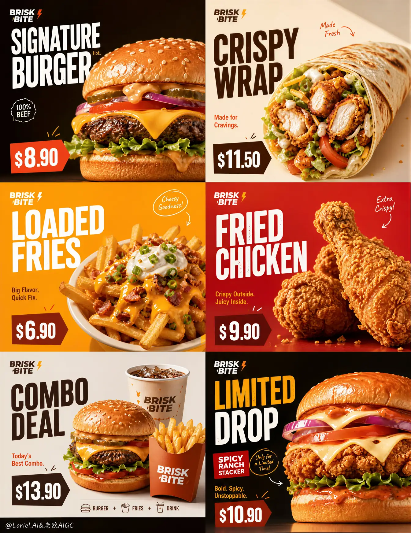
For restaurant marketers, this fast food poster prompt organizes six offers into an immediately scannable six-panel 2×3 menu campaign, with a food hero, stacked title, and price anchor carrying the same clear role in every card.
Image Example

Strategic Deployment Guide
Model fit: Start with ChatGPT’s image model when you need strong adherence to the six-card hierarchy and readable English price blocks. Replace every [variable], then keep the strict 2×3 geometry, one-hero-per-card rule, and food-first hierarchy intact before correcting any generated microcopy in a design tool.
Fast Food Poster Prompt Code
BRAND IDENTITY AND OUTPUT FORMAT:
Create an ultra-premium six-panel promotional poster for [fictional fast-food brand]. Use a strict equal 2x3 grid: each square panel is an individual high-impact menu card, and all six cards belong to one coherent campaign. Render a commercial, print-ready campaign image at [output ratio], with the brand identity consistently visible but never larger than the food hero.

PRODUCT-TIER VARIATION AND PANEL HIERARCHY:
Use these six editable product tiers: [product tier 1], [product tier 2], [product tier 3], [product tier 4], [product tier 5], and [limited-time product tier]. Give every panel one dominant photoreal food hero, one large stacked English title, one readable price tag, one short supporting line, and only one or two minimal handwritten accents. Vary silhouette, ingredients, portion, and appetite mood across the six product tiers while preserving the same card order and spacing.

LAYOUT, TYPOGRAPHY, AND COLOR DIRECTION:
Keep strong negative space around each food item. Build a unified high-contrast campaign palette from [visual style and brand colors], varying backgrounds and graphic blocks without breaking the shared system. Use a small consistent logo treatment for [brand name]. Use bold, modern English-only typography and naturally integrated prices: [price 1-6]. Keep title and price clear of the food silhouette. Let arrows, circles, and handwritten marks point only to a price or selling point; never let decorative accents create a second information hierarchy.

FOOD REALISM, LIGHTING, AND NEGATIVE CONSTRAINTS:
Make buns soft and glossy, fried textures crisp, cheese hot and elastic, sauces rich, and vegetables fresh. Use soft high-end commercial food lighting with controlled shadows, subtle crumbs or steam, and a bright polished finish. The food stays the visual hero; titles and prices support it. Avoid a collage effect by keeping each plate or package fully legible inside its own panel. Output ratio: [output ratio].

Negative prompt: cluttered composition, cartoon food, weak product focus, unreadable prices, fake ingredients, messy typography, generic supermarket styling, flat lighting, oversaturated chaos, low-resolution textures.
Implementation Steps
- Map the six tiers first: Assign a distinct silhouette and appetite role to each product tier before writing the title or price copy.
- Lock the 2×3 rhythm: Keep equal panel proportions and reserve the same information zones for the food, title, and price in every card.
- Generate one campaign system: Change backgrounds and product moods, but reuse the brand palette, logo scale, and typographic weight so the cards still read together.
- Repair production copy: Check all generated names, prices, and logo details manually; use Figma or Illustrator for vector typography and layout repair before the poster becomes paid media or a live menu asset.
Application Scenarios
- Store-launch menu walls: Create a coherent six-product visual for counter displays, digital menu boards, or opening-week prints.
- Delivery-app promotion sets: Turn each card into a crop-ready offer tile while retaining a recognizable campaign system across the listing.
- Limited-time product drops: Reserve one card for a seasonal or trial item without making the campaign look like an unrelated flyer.
- Agency concept boards: Present a menu hierarchy and fast-food art direction before a food stylist, retoucher, or layout designer builds final assets.
Why This Prompt Works
The fixed 2×3 grid prevents six products from competing as one unstructured menu. Repeating a food hero, title, and price anchor gives each card a predictable reading order, while the tiered lineup creates useful differences in shape, portion, and urgency. Variables keep the brand, food, prices, and copy reusable without weakening the source method: a single commercial campaign rather than six disconnected food images.
Troubleshooting & Optimization
- If one dish overwhelms its card: append “one centered food hero with generous negative space; no secondary product cluster.”
- If panels stop reading as one campaign: append “equal 2×3 panel proportions, consistent logo scale, shared typographic family, controlled palette.”
- If prices or titles become unreadable: append “large high-contrast price tag and bold stacked English title, clear of the food silhouette.” Then replace final copy manually.
- If food looks synthetic: append “commercial food photography, crisp fried texture, glossy sauce, hydrated vegetables, soft controlled highlights.”
Common Questions
- Q: What does this fast food poster prompt create?
A: It creates one unified 2×3 menu campaign with six equal cards, each built around a product hero, stacked title, and price anchor. - Q: Can I replace every source food item?
A: Yes. Replace the six product tiers, names, prices, brand, copy, and colors, but preserve the equal grid and one-hero-per-card information hierarchy. - Q: Should generated menu text be used without editing?
A: No. Use the render for food art direction and panel structure, then verify prices, claims, titles, and logo treatment in the final production file.
Use this prompt to build your version? Share the result in the comments.
Explore more? View Image & Design or Prompt Engineering Guides.
Follow @bigprompt for more prompts and workflow systems.
Related Big Prompt Hub pages:
Food Advertising Poster Prompt for Menus and Restaurant Campaigns
Coffee Advertising Poster Prompt for Futuristic Brand Dashboard Campaigns
AI Food Prompts That Cover Photography, Ads, Graphics, and Video
Juice Advertising Poster Prompt for Beverage Campaign Visuals
Food Hero Shot Prompt for Luxury Food Photography
Big Prompt Hub Review
This prompt is most useful when a restaurant needs campaign-level order rather than a collage of menu items. Its strongest control is the repeated food/title/price hierarchy, which helps the six cards remain scannable while product tiers still feel different. It is a concept and visual-direction tool, not a substitute for approved pricing, final typography, or food-retouching work.