
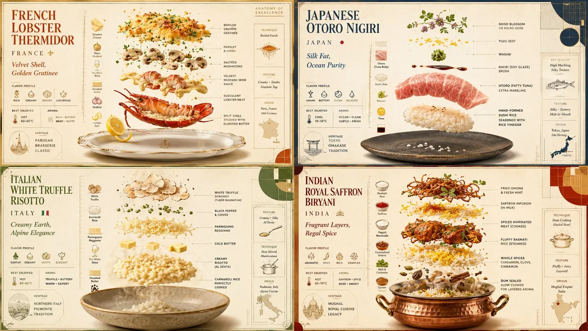
For food designers and restaurants, a luxury culinary poster prompt turns dishes into premium 2×2 ingredient diagrams with exploded-view structure, recipe-card warmth, Bauhaus grid logic, menu-ready typography, verified ingredient data, and campaign-ready visual consistency online.
Image Example

Strategic Deployment Guide
Model fit: Use GPT Image first because this prompt needs readable poster composition, ingredient callouts, and stylized typography zones. Keep the 2×2 grid, replace the dish variables, and review labels manually before using the result in a real menu or campaign asset.
luxury culinary poster prompt Code
POSTER SYSTEM:
Create a 2x2 grid of vertical luxury culinary posters in 16:9 presentation format. Use this style DNA: ultra-premium exploded-view product advertisement + vintage recipe-card illustration + European cafe menu design + Bauhaus culinary grid system.

SUBJECT AND DATA:
For each poster, show [dish name] from [region or cuisine] as a floating luxury object, partially assembled from its ingredients. Include [ingredient 1], [ingredient 2], [sauce], [spice], [garnish], [cooking method], and [serving vessel]. Add verified [data labels and flavor facts] for flavor, texture, temperature, aroma, and regional identity. Keep every fact short enough to read as a poster callout.

LAYOUT AND MATERIALS:
Use geometric plates, measurement marks, flavor icons, modular typography, matte ceramics, [material swatches], ingredient swatches, recipe annotations, restrained steam, warm archival paper texture, premium shadows, and precise material separation. Typography should read: [dish name] / [region] / [flavor tagline]. Reserve one quiet margin for measurement marks and one corner for a small flavor icon set.

STYLE AND OUTPUT:
Use [color palette], premium studio lighting, warm paper, culinary nostalgia, elegant food diagrams, and [output aspect ratio or export size].

QUALITY CONTROL:
Make the dish recognizable at thumbnail size. Keep labels aligned to the grid, avoid overlapping callouts, and preserve enough negative space around each ingredient layer. Make the final image look like a premium editorial menu board rather than a busy recipe infographic.

FOUR POSTER VARIATION PLAN:
Create four different dishes in the same system. Keep each poster's plate geometry, callout spacing, and paper texture consistent, but vary the dish silhouette, ingredient color, garnish placement, and regional motif. Use one clear hero ingredient per poster, one secondary ingredient cluster, one sauce or spice detail, and one serving vessel cue. Do not let one panel become more photographic or more cartoon-like than the others. Treat the set as a coherent brand campaign that could sit together on a restaurant wall, delivery-app carousel, or menu launch page.

NEGATIVE CONSTRAINTS:
No messy table scene, no generic stock-food photography, no random ingredients, no unreadable labels, no warped plates, no cluttered typography, and no watermark.
Implementation Steps
- Verify the dish data: Fill the dish, region, ingredients, sauce, spice, garnish, cooking method, and material variables before rendering.
- Lock the layout: Keep the 2×2 grid, measurement marks, aspect ratio, and modular typography so the posters read as one collection.
- Plan post-processing: Use Photoshop or Illustrator to repair label alignment, typography spacing, and small ingredient callouts after generation.
- Review the labels: Check every ingredient callout, flavor note, and region label before publishing or sending the poster to a client.
Application Scenarios
- Restaurant teams: Build a premium menu poster set for seasonal dishes or chef specials.
- Food brands: Create campaign assets that show ingredients, origin, and flavor in one polished graphic.
- Packaging designers: Explore label art, recipe cards, and product inserts before final illustration.
Why This Prompt Works
The prompt works because it combines food data with a strict design system. Ingredient variables keep the poster useful, while the exploded-view layout, warm paper texture, and Bauhaus grid stop the image from drifting into ordinary restaurant photography.
Troubleshooting & Optimization
- If the dish looks generic: replace broad ingredient words with specific regional ingredients and append the phrase “verified cuisine-specific details.”
- If labels are unreadable: add the phrase “large clean typography, fewer callouts, generous spacing.”
- If the grid feels cluttered: remove one garnish or icon layer and instruct the model to preserve negative space.
luxury culinary poster prompt FAQ
- Q: What is a luxury culinary poster prompt?
A: A luxury culinary poster prompt is a reusable image prompt for turning dishes into premium ingredient diagrams with menu-style typography and polished food-ad composition. - Q: Should I let the model infer ingredients?
A: Only for rough exploration. For a real menu, verify dish ingredients, region, cooking method, and callouts before publishing. - Q: Which model should I use?
A: Use GPT Image when you need cleaner poster layout, typographic zones, and ingredient separation.
Use this prompt to build a premium food poster, then verify every ingredient label and regional cue before treating the image as menu-ready.
Explore more visual prompt systems in Image & Design and campaign ideas in Marketing & Growth.
Follow @bigprompt for more prompts and workflow systems.
Related Big Prompt Hub pages:
GEO SEO Claude Code Skill Collection for AI Search Audits
AI Website Audit Prompts: Seven Checks Before a Redesign
Seedance Product Commercial Video Workflow: Reference-Locked Ads
Figma to React Agent Workflow for Production Components
Risograph Travel Poster Prompt for City Stories and Print Texture
Big Prompt Hub Review
This is a strong prompt for food-design teams because it asks for an information-rich poster rather than a generic appetizing image. Its main limit is factual ingredient accuracy, so the final asset still needs human review before it appears on a menu, package, or paid campaign.