
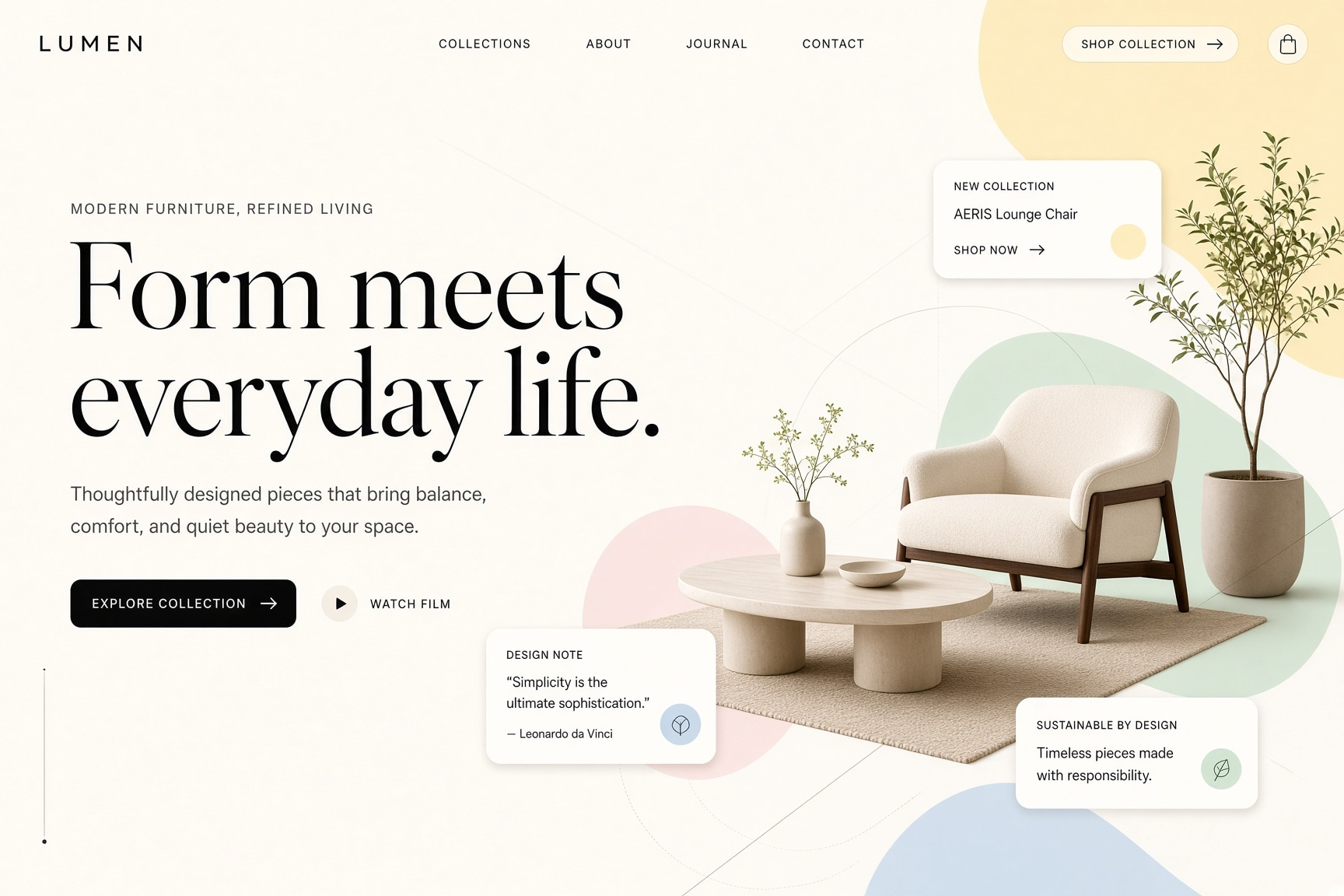
Web designers shaping premium landing pages often need a web design prompt that protects hierarchy before decoration. This reusable direction keeps the hero copy on the left, product imagery on the right, and supporting cards quiet enough to preserve negative space. The result is a polished editorial concept suitable for client review, art-direction exploration, and a later Figma build.
Image Examples


Strategic Deployment Guide
Model fit: ChatGPT Image is a practical primary choice when readable visual hierarchy and product cutouts matter; Gemini is a useful fallback when the first result loses the asymmetric grid. Replace only the subject, keep the left-copy/right-image split, and treat the output as an art-direction concept that still needs production typography and responsive layout work.
web design prompt Code
Design of [SUBJECT], minimalist editorial art direction, high-end web design aesthetic, oversized elegant serif typography, clean geometric sans-serif supporting type, left-aligned hero content, generous negative space, visual hierarchy weighted toward the left, large product imagery positioned on the right, asymmetric editorial composition, floating rounded content cards surrounding the main visual, subtle thin geometric construction lines, soft dimensional shadows, warm white background, restrained pastel palette of butter yellow, mint green, powder blue, blush pink and warm beige, crisp black typography, smooth photographic cutouts, polished product-render feel, refined premium atmosphereImplementation Steps
- Define the page subject: Name one concrete offer, such as a fitness membership, lounge chair, reservation service, or coffee subscription, so the hero image has a clear product focus.
- Protect the editorial layout: Keep the headline, supporting copy, and primary CTA in the left third while the product render or lifestyle scene occupies the right half.
- Control typography and cards: Use the serif face only for the hero statement, geometric sans-serif for navigation and labels, and three or four rounded cards for proof, features, or service data.
- Prepare the Figma handoff: Rebuild generated words, buttons, navigation, spacing, accessible contrast, and responsive breakpoints before the direction enters production.
Application Scenarios
- Landing-page concept exploration: Product designers can compare premium homepage directions before investing in wireframes and component design.
- Client pitch decks: Brand studios can show a polished hero route alongside strategy, moodboards, and proposed typography.
- Furniture and fitness pages: Ecommerce and membership teams can frame a product or person as the right-side hero while benefits remain easy to scan.
- Dining and coffee pages: Hospitality teams can pair restaurant photography or subscription packaging with booking, delivery, rating, or value cards.
Why This Prompt Works
The prompt assigns a distinct role to every layer. Oversized serif type establishes the editorial voice, geometric sans-serif type carries navigation and supporting detail, and the right-side product image creates a single visual anchor. Floating cards introduce evidence without turning the page into a dashboard. The warm white base, thin construction lines, restrained pastels, and soft shadows keep the composition dimensional while preserving the negative space that makes it feel premium.
Troubleshooting & Optimization
- If the result becomes centered: append “lock hero copy to the left third and place the main product image in the right half.”
- If the palette becomes loud: append “use warm white with muted butter yellow, mint, powder blue, blush, and beige; use crisp black typography only.”
- If it looks like a dashboard: append “show one polished product scene and no more than four quiet rounded information cards.”
Editorial Landing Page FAQ
- Q: What does this web design prompt create?
A: It creates a premium landing-page concept with editorial typography, a left-led hierarchy, a right-side product scene, and restrained floating cards. - Q: What should I change first?
A: Change the subject first. The layout, type contrast, negative space, and pastel palette form the reusable art-direction system. - Q: Is the generated page ready to build?
A: No. Use it as a visual direction, then recreate copy, navigation, components, accessibility states, and responsive behavior in your design tool.
Use this prompt to explore your own editorial landing-page direction, then share the result in the comments.
Explore more? View Image & Design or Prompt Engineering Guides.
I hope you found this web design AI prompt helpful.
Follow @bigprompt for more prompts and workflow systems.
Continue with related visual prompt systems:
Turn product hierarchy into a commercial campaign poster
Explore a softer editorial direction with watercolor city posters
Build dimensional travel scenes with paper-cut diorama styling
Study premium product focus in a skincare advertisement layout
Compare polished product rendering with 3D origami papercraft
Big Prompt Hub Review
This prompt is strongest as an early art-direction tool for teams that need a clear premium web concept before wireframing. Its main value is the disciplined hierarchy: editorial type on the left, a product-led scene on the right, and sparse cards that make the composition feel like a page instead of a poster. It does not replace content design, accessibility work, or responsive UI decisions, so the final interface still requires careful human implementation.