
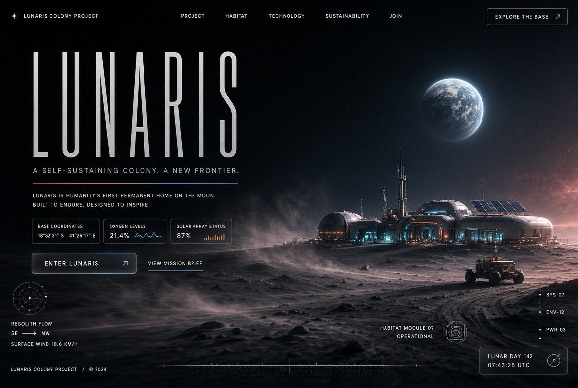
Product designers, creative directors, and founders shaping a technology launch need a landing page hero prompt that establishes atmosphere before a team writes UI copy or builds responsive components. This one is designed for a first-screen concept where the image carries atmosphere while type, data, and calls to action remain readable.
Image Examples


Strategic Deployment Guide
Model fit: Start with an image model that can follow long compositional instructions and render small interface-like details; use a second model only to compare hierarchy, not to add unsupported visual features. Set the variables as a short art-direction brief, then preserve the fixed tonal and typographic method for the first pass.
Landing Page Hero Prompt Code
IDENTITY CONTROL: Landing page hero section design for [SUBJECT IDENTITY]. The subject should feel specific, credible, and central to a technology-facing product, service, place, or system. It is not a decorative secondary object: it anchors the page story and determines the photographic evidence, the operational context, and the visual emphasis.

SCENE LOGIC: Use an oversized immersive photograph of [PRIMARY PHOTOGRAPHIC SCENE] as the hero focal point. Place it in a dark near-black environment with a sense of depth, soft-focus motion, atmospheric haze, and layered visual information. Let the subject emerge from deep charcoal shadows into pale highlights. The scene should imply a real operating context while leaving room for interface cues rather than becoming a cinematic still with no landing-page purpose.

LAYOUT COMPOSITION: Build a contemporary editorial tech web design with [LAYOUT COMPOSITION]. Reserve generous negative space on the [HEADLINE SAFE SIDE] for live headline, supporting copy, and a primary action. Use one dominant focal area, then layer subtle translucent glass UI elements around it. Add thin technical graphics and delicate [DATA-ANNOTATION THEME] annotations as sparse visual information, not as a crowded dashboard. Keep the visual hierarchy asymmetric, calm, and legible at a glance.

STYLE DIRECTION: Use restrained natural saturation, cinematic tonal depth, soft bloom, tactile film grain, condensed typography, and a refined futuristic aesthetic. Blend warm [WARM ACCENT COLOR] with cool [COOL ACCENT COLOR] while retaining deep charcoal shadows and pale highlights. Apply [STYLE DIRECTION] consistently across lighting, texture, and graphic treatment; do not let the glass elements or technical lines compete with the photograph.

PRODUCTION FORMAT: Deliver as a [OUTPUT FORMAT], composed as a production-ready hero concept with a readable headline safe zone, clear subject crop, and enough edge detail to evaluate desktop and mobile variations. Generate visual typography only as an art-direction cue; real copy and controls will be rebuilt as accessible live UI.

NEGATIVE PROMPT: readable generated body copy, invented logos, crowded dashboard grids, flat vector illustration, oversaturated neon, duplicate focal subjects, watermark, broken anatomy, clipped hero subject, or a composition with no usable negative space.
Implementation Steps
- Name one clear hero subject: Use a concrete product, mission, facility, or technology, then set the photographic scene and annotation theme to match. A narrow brief gives the information layers something coherent to describe.
- Generate the composition before the interface: Judge the first output for negative space, focal depth, and the amber-to-cyan lighting balance. Do not treat tiny generated labels as production copy.
- Translate it into a real hero: Rebuild the approved direction in Figma or code with semantic navigation, accessible contrast, responsive type, and real content instead of rasterizing the entire screen.
- Run a crop check: Test desktop, tablet, and 390px mobile crops. Keep the core image, headline area, and primary action visible before approving the art direction.
Application Scenarios
- Frontier-technology launch pages: Product marketing teams can use the direction for a space, climate, robotics, or mobility website hero before a launch-page design sprint.
- Premium product narratives: B2B brand teams can frame a hardware, security, or research product for a homepage or investor-deck cover with one photographic moment and restrained operational context.
- Creative pitch boards: Agency art directors can present a campaign landing-page direction to a client, showing how motion, atmosphere, data cues, and editorial typography can work together before a full design system exists.
Why This Prompt Works
The prompt creates a usable hero direction through four linked constraints: a single photographic scene establishes the focal hierarchy; a near-black canvas and controlled warm-cool palette create separation without neon overload; an explicit headline-safe side reserves space for live copy; and sparse annotation cues make the result read as a product interface instead of a standalone sci-fi poster. The editable brief fields keep those relationships intact when the subject, colors, information theme, or export format change.
Troubleshooting & Optimization
- If the result becomes a poster: Append: “preserve one clear headline safe zone and one primary action area; do not fill the frame with decorative objects.”
- If the colors become neon: Replace the palette clause with: “muted, naturally saturated warm-cool color relationship; no neon glow.” The atmosphere should come from tonal depth and bloom, not maximum vibrancy.
- If data panels are unreadable: Append: “use sparse abstract data marks rather than legible UI copy,” then recreate only the useful information as live, accessible UI during implementation.
FAQ
- Q: What does this landing page hero prompt make?
A: It creates a dark editorial technology hero concept with immersive photography, atmospheric color, sparse glass UI, condensed type, and technical annotations. - Q: What should I change first?
A: Change the subject first. The cinematic tonal treatment, palette relationship, information layering, and asymmetric structure are the reusable design method. - Q: Can I use the generated screen as production UI?
A: Use it as art direction only. Rebuild every text label, navigation element, control state, and contrast decision with real content and accessibility testing.
Use this prompt to explore a dark editorial landing-page direction, then adapt the approved concept into a responsive interface.
Explore more in Image & Design and Prompt Engineering Guides.
Follow @bigprompt for more prompts and workflow systems.
Related visual prompt systems:
Explore layered editorial texture with a vintage travel collage poster prompt
Build a brighter product hierarchy with the premium editorial web design prompt
Turn a focal product into a commercial campaign poster composition
Compare the dark hero system with a warm watercolor city-poster direction
Use a character-development skill when a narrative subject needs structured visual references
Big Prompt Hub Review
This prompt is most useful when a team needs a strong visual hypothesis for a technology-facing landing page, not a finished website. Its value is the controlled relationship between photography, negative space, atmosphere, and technical detail. It will not solve product messaging, interaction design, performance, or accessibility; those decisions still need deliberate human design and implementation.