
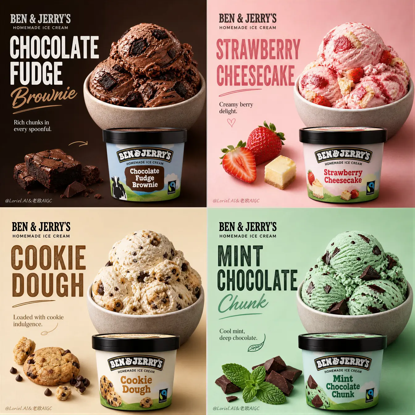
Ice-cream marketers and packaging designers reach for an ice cream poster prompt when four documented flavors must read as one premium 2×2 campaign. The layout keeps product placement, flavor moods, package hierarchy, and English display copy consistent enough for a real launch review while leaving brand-specific claims for human approval.
Image Examples

Strategic Deployment Guide
Model fit: GPT Image 2 is preferred for this ordered multi-panel brief because it can hold a single image canvas while balancing product texture, typography zones, and repeated placement. If that model is unavailable, choose the steadiest current image model for structured grids. Before generating, attach a rights-cleared packaging reference if the brand or pint label must remain recognizable; then fill the four flavor, palette, copy, and output variables. Keep the 2×2 grid and matched bowl rhythm fixed, and proofread every generated label before the asset reaches a campaign layout.
Ice Cream Poster Prompt Code
CAMPAIGN IDENTITY:
Brand and brand line: [rights-cleared ice cream brand and brand line]
Campaign goal: [launch, seasonal promotion, menu board, or social campaign]
Flavor lineup in reading order: [flavor 1], [flavor 2], [flavor 3], [flavor 4]

Create one ultra-premium four-panel ice-cream advertising poster. Preserve a strict 2x2 grid with four equal panels, consistent spacing, and one coherent luxury campaign rather than four unrelated images.

PRODUCT SYSTEM:
Each panel contains one clearly readable [pint or package format], one matching scoop or plated serving, a few real ingredient accents, a strong flavor title, one short supporting line, and restrained brand presence. Use the supplied product reference, when provided, to preserve the package silhouette, lid, label hierarchy, and flavor identity without inventing unsupported claims.

PANEL ORDER AND PLACEMENT:
Panel order: [top-left, top-right, bottom-left, bottom-right flavor mapping]
Keep every bowl or serving vessel at the same apparent size, camera height, and placement logic. Keep every pint at the same relative lower or lower-middle anchor. Make every bowl fully visible and reserve clean negative space for typography.

FLAVOR WORLDS:
Flavor 1 identity, ingredients, and mood: [color, inclusions, restrained garnish, emotional flavor mood, and supporting line]
Flavor 2 identity, ingredients, and mood: [color, inclusions, restrained garnish, emotional flavor mood, and supporting line]
Flavor 3 identity, ingredients, and mood: [color, inclusions, restrained garnish, emotional flavor mood, and supporting line]
Flavor 4 identity, ingredients, and mood: [color, inclusions, restrained garnish, emotional flavor mood, and supporting line]
Make the four moods immediately distinct while keeping the same premium family: dark indulgence, fruity brightness, baked comfort, and cool freshness are one possible example set.

BACKGROUND, TYPE, AND BRANDING:
Panel palette: [four coordinated premium background colors mapped to the four flavors]
Typography: use English-only display type with one large flavor title, one short supporting line, and the approved brand line. Keep the hierarchy bold, clean, modern, and legible; add only a tiny underline, arrow, or flourish when it improves the flavor cue.

REALISM AND LIGHTING:
Render dense, creamy scoop ridges, believable inclusions, fresh fruit, crisp mint or chocolate, and accurate package materials. Use soft high-end studio lighting, short controlled shadows, delicate highlights, restrained condensation, and a clean editorial surface. Keep ingredient accents sparse and appetizing.

NEGATIVE CONSTRAINTS:
Avoid [cropped bowls, inconsistent vessel sizes, drifting pint placement, clutter, plastic food, unreadable text, fake claims, noisy backgrounds, cartoon rendering, flat lighting, and low-resolution texture].

OUTPUT:
Canvas, ratio, and delivery use: [target pixel size, aspect ratio, print or screen use, safe margins, and export format]
Deliver one balanced, immediately readable four-panel campaign image. Treat generated typography and package claims as drafts that require human verification.
Implementation Steps
- Document the lineup: List four real flavors, their ingredients, approved names, brand line, and the short supporting line for each panel. Use rights-cleared packaging references for recognizable labels.
- Lock the grid before styling: Decide the reading order, equal panel proportions, safe margins, bowl anchor, pint anchor, and typography area before adding flavor details.
- Map mood to evidence: Give every flavor a color, texture, and restrained ingredient cue that a shopper can recognize without relying on invented health or product claims.
- Generate one coherent pass: Fill all variables and keep the matched bowl and pint rhythm unchanged. Do not assemble four unrelated outputs into a grid after the fact; use post-render layout repair and approved vector typography for any label or spacing correction.
- Proof the delivery asset: Check panel order, label spelling, bowl visibility, package proportions, supporting copy, contrast, and mobile/social crop safety in a layout tool.
Application Scenarios
- Seasonal flavor launches: Present four limited or returning flavors as a single collectible social and landing-page visual.
- Retail menu systems: Give a dessert counter or delivery menu a consistent hero image while keeping each flavor easy to scan.
- Packaging concept reviews: Compare flavor palette, ingredient cues, and pint rhythm before commissioning final photography or art direction, then apply post-render layout repair and approved vector typography.
- Agency campaign exploration: Test several rights-cleared product lineups without losing the strict display system that makes the series feel premium.
Why This Prompt Works
The prompt separates fixed campaign structure from replaceable product data. A strict 2×2 order and matched bowl/pint placement create visual continuity, while the flavor-world variables give each panel a distinct color, texture, ingredient cue, and emotional promise. The negative constraints protect the premium read, and the final human-proofing step keeps generated labels and claims from being mistaken for approved packaging.
Troubleshooting & Optimization
- The grid drifts: Restate equal panel proportions, exact reading order, matched spacing, and one image output; remove extra scene directions that compete with the layout.
- Bowls or pints change size: Repeat the same camera height, vessel scale, anchor area, and fully-visible requirement for all four panels.
- Flavors look too similar: Increase the evidence-based contrast between base color, inclusions, garnish, background, and supporting line while keeping the typography system shared.
- Labels are wrong: Treat generated type as a draft, then correct names and package details in a design tool or replace the text layer with approved artwork.
- The crop loses a panel: Generate with safe margins and test the square, portrait, and mobile crops before publishing the campaign.
Common Questions About Ice Cream Poster Prompts
- Q: What does an ice cream poster prompt control?
A: It controls a four-panel layout, matched bowl and pint placement, flavor-specific visual evidence, typography hierarchy, lighting, and output settings while leaving brand and product data replaceable. - Q: Can I keep the four-panel layout but change the brand?
A: Yes. Replace the brand, lineup, packaging reference, palette, and copy with rights-cleared inputs while retaining the strict 2×2 and matched display controls. - Q: Should the model invent flavor names or claims?
A: No. Supply documented names and approved copy, then proof every label and claim with a human before commercial use. - Q: Is this a substitute for final product photography?
A: It is a concept and campaign exploration tool. Final packaging, legal copy, nutrition information, and production photography still require the responsible brand and creative teams.
Use this prompt to explore a flavor campaign, then share the result in the comments after checking rights, labels, and crop safety.
Explore more visual systems in Image & Design and Prompt Engineering Guides.
I hope you found this ice cream poster prompt useful.
Follow @bigprompt for more prompts and workflow systems.
Related Big Prompt Hub pages:
Fast Food Poster Prompt for a Six-Panel 2×3 Menu Campaign
Real Fruit Juice Poster Prompt for Product-Focused Campaigns
Juice Advertising Poster Prompt for Premium Beverage Visuals
English Novel Cover Prompt for Story-Led Book Jackets
AI Architectural Rendering Prompt for Material-Led Scenes
Big Prompt Hub Review
This is a strong concept-stage asset for teams that need one readable visual system across several flavors. Its main value is the disciplined relationship between panel order, product placement, flavor evidence, and typography; it does not approve trademarks, package copy, nutrition claims, or final commercial photography. Use the variable block as the creative brief, then have a designer and the responsible brand team verify every public-facing detail.