
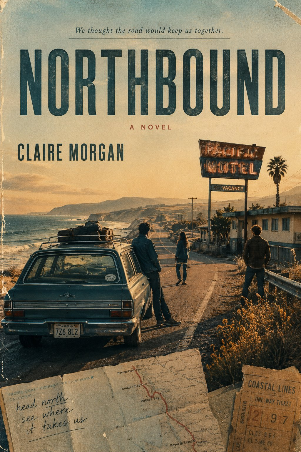
For indie novelists, cover designers, and writing coaches, an English novel cover prompt should begin with the emotional promise of a story—not a generic request for an attractive poster. This reusable brief turns character relationships, conflict, location, a telling object, mood, and genre into one original 2:3 cover direction with title, author, and tagline.
Image Examples
These three user-supplied outputs show the same prompt taking different visual routes. They are examples of story-specific cover art, not reusable titles or fixed story templates.


Strategic Deployment Guide
Model fit: use an image generator that can follow a long natural-language brief and render readable cover typography. The source itself does not require one named model. Prepare a concise story brief first, then give the model the editable fields below; the point is to choose one meaningful visual idea rather than to list every plot event.
Keep the ratio at 2:3 when you want a front-cover concept. Treat the generated title and author text as an art-direction pass: inspect spelling, hierarchy, and edge clearance before using a result in a book listing or print layout.
English Novel Cover Prompt Code
[NOVEL TITLE]:
[AUTHOR]:
[GENRE]:
[ONE-SENTENCE STORY]:
[MAIN CHARACTERS / RELATIONSHIP]:
[CORE CONFLICT]:
[KEY LOCATION]:
[KEY SCENE OR OBJECT]:
[CORE MOOD]:
[TAGLINE]:
[COLOR DIRECTION]:
[VISUAL STYLE]:
[ASPECT RATIO]: 2:3 vertical

Create an original English novel cover based on the story above.

First understand the novel, then extract its emotional core, character relationships, key scene, visual symbol, and overall identity. Do not generate a random attractive image based only on the title.

Use the most meaningful scene, object, location, or relationship from the story as the main visual concept. Build clear foreground, middle ground, and background depth, with subtle narrative clues that make the viewer curious without explaining the entire plot.

Choose the visual language according to the genre. It may use cinematic photography, architectural composition, vintage paperback design, editorial illustration, collage, or another suitable publishing style. Different stories should naturally produce different compositions, typography, colors, and atmospheres.

Include:
- Novel title
- Author name
- One short tagline
- Optional small genre or publishing text

Typography must feel integrated into the scene and follow the image structure. Do not always place all text on the same side. Use serif, sans-serif, condensed, handwritten, or display typography according to the story.

The final image should feel like a complete, professionally published novel cover with visual depth and strong storytelling—not a movie poster, generic photo poster, tourism ad, or book mockup.

Avoid excessive minimalism, overcrowded text, meaningless decorative copy, Vol.01, issue numbers, page numbers, repetitive layouts, generic AI aesthetics, and unrelated visual elements.

Generate one standalone cover only. Do not create a grid, collage of multiple covers, or physical book mockup.
Implementation Steps
- Write the story spine first: give the one-sentence story enough tension to identify what changes, what is at risk, and what the cover should make a reader wonder about.
- Name one cover anchor: choose the decisive relationship, location, scene, or object, then repeat it in the key-scene field. A rain-soaked window, motel sign, or closed bookstore is stronger than a list of plot props.
- Set the 2:3 composition before styling: reserve clean title and author margins, then match the color direction and visual style to the genre rather than borrowing one palette for every story.
- Run a typography post-production pass: inspect spelling, hierarchy, contrast, and edge clearance; use layout repair or rebuild critical title and author copy in a design tool when needed.
Application Scenarios
- Indie fiction launch listing: create a first cover direction for a contemporary romance, mystery, literary novel, or road story before commissioning final layout for a retailer preview.
- Writing workshop cover brief: give a critique group a 2:3 art-direction sheet that exposes whether the premise, relationship, and genre promise are actually clear.
- Book-series concept deck: reuse the field structure across several manuscripts while changing the story symbol, palette, and typography to keep each title distinct for a publisher or studio review.
Why This Prompt Works
The structure makes story meaning a required input. Instead of asking for a beautiful cover and hoping the model guesses the genre, it asks for the character relationship, conflict, location, key scene or object, mood, and color direction. Those fields give the image a foreground, middle ground, and background with narrative clues.
It also separates the information that should stay fixed from the information that should change. The 2:3 vertical output, standalone-cover constraint, and ban on mockups protect the format; the book identity, setting, scene, mood, and visual language remain reader-editable.
Common Mistakes
- Starting from the title alone: add the relationship and conflict before asking for visual style.
- Using every plot object: choose one key scene or symbol so the composition has a clear focal point.
- Accepting unreadable copy: rerun or rebuild typography when the title, author, or tagline is misspelled or crowded.
Troubleshooting & Optimization
- The result feels like a movie poster: append “complete front cover, not promotional key art; use one book-jacket visual symbol” to the prompt.
- The genre feels wrong: replace the genre, mood, color direction, and visual-style fields rather than adding unrelated decorative details.
- The scene is attractive but empty: rewrite the one-sentence story and core conflict, then substitute a location or object that can carry that tension.
- Typography competes with the image: append “reserve clear title margins and integrate type with the composition,” then shorten the tagline.
FAQ
- Q: What is this English novel cover prompt designed to produce?
A: One original 2:3 book-cover concept that uses your story inputs to choose a genre-aware scene, visual symbol, cover copy, and overall mood. - Q: Which fields matter most if I have only a short synopsis?
A: Start with genre, one-sentence story, main relationship, core conflict, and one location or object. Add color and style after those choices are clear. - Q: Should I use the generated typography as final print-ready type?
A: Treat it as art direction. Check spelling, contrast, and hierarchy, then rebuild any critical title or author copy in a design tool when needed. - Q: Can the same template work across different fiction genres?
A: Yes. The shared structure stays intact while the story, visual symbol, color direction, and genre-specific visual language change.
Use this prompt to generate your version? Share the result in the comments.
Explore more? View Image & Design or Prompt Engineering Guides.
Follow @bigprompt for more prompts and workflow systems.
Keep Exploring Visual Prompts
For a related 2:3 travel-art direction, try the scrapbook travel poster prompt when a destination, keepsake, and paper texture need to carry the story.
Use the travel poster prompt for city scenes when the setting must do more of the narrative work than the characters.
Explore the football collectible prompt for a different lesson in balancing a hero subject, supporting details, and cover-like hierarchy.
See the brand identity guideline board prompt when your project needs a more structured visual system before final design.
For motion-first cover-adjacent imagery, read the Video Shotcraft skill guide and compare how a reviewable scene differs from a still book jacket.
Big Prompt Hub Review
This template gives authors a story-first way to brief an image model before it reaches for style. Its most useful constraint is the requirement to select one meaningful relationship, scene, object, or location. Its practical limitation is typography: generated cover text still needs a human check before any reader-facing release.