
Tourism marketers often need a travel sketchbook illustration prompt that turns one destination into an annotated hand-drawn journal spread. This version gives travel illustrators, editorial designers, and city-guide publishers a reusable hierarchy for a hero landmark, supporting scenes, restrained watercolor, paper texture, and short handwritten notes while leaving every city-specific detail open to research and replacement.
Image Examples
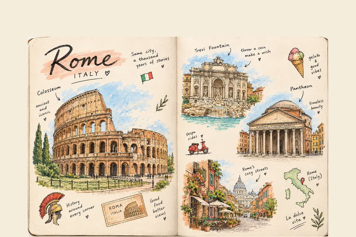
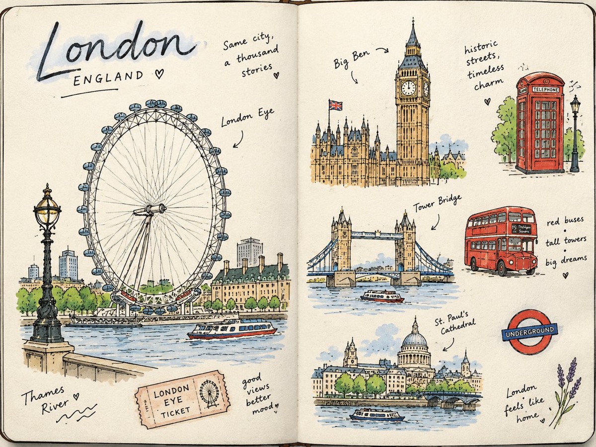
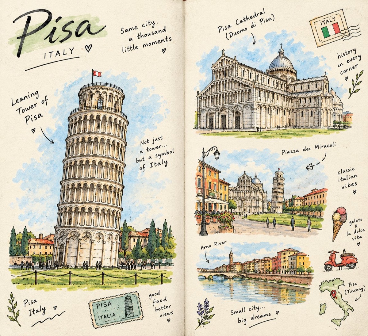
Strategic Deployment Guide
Model fit: GPT Image 2.5 is the recommended primary model because the source identifies it and provides three completed outputs. Use another image model only when GPT Image 2.5 is unavailable and the alternative can preserve recognizable architecture, a two-page layout, short handwritten labels, and controlled ink-and-watercolor texture. Verify landmarks and generated lettering before publication.
Travel Sketchbook Illustration Prompt Code
IDENTITY:
Create a beautiful, hand-drawn travel sketchbook illustration titled “[CITY, COUNTRY]”. Feature [FAMOUS LANDMARK] as the main visual anchor, supported by [2–4 OTHER LOCAL ATTRACTIONS] and authentic everyday details from the destination.

LAYOUT:
Create an open two-page sketchbook spread using [LAYOUT AND SPACING]. Place one large, detailed hero drawing of the main landmark on the left page. Arrange several smaller illustrated scenes on the right page, chosen from [LOCAL BUILDINGS, SQUARES, WATERFRONTS, STREETS, BRIDGES, GARDENS, OR MONUMENTS]. Preserve generous untouched paper around the drawings and keep a clear one-large-plus-several-small hierarchy.

LANDMARK ACCURACY:
Keep the main landmark recognizable and architecturally accurate. Preserve its authentic silhouette, proportions, structure, and distinctive details. Use [VERIFIED LANDMARK FEATURES] to prevent a generic substitute. Let the smaller sketches capture the personality and atmosphere of the destination without repeating the same building.

ART STYLE AND MATERIALS:
Use [INK AND WATERCOLOR STYLE], loose imperfect pen strokes, expressive line variation, and authentic hand-drawn irregularities. Render everything on [WARM-WHITE TEXTURED SKETCHBOOK PAPER]. The page should feel playful, personal, artistic, and made during a real journey.

ANNOTATIONS AND LOCAL DETAILS:
Add [SHORT LANDMARK LABELS AND LOCATION NOTES], little arrows, dotted routes, a ticket-stub illustration, [LOCAL TRANSPORT], [LOCAL TREES OR PLANTS], and [EVERYDAY CITY DETAILS]. Keep the handwriting natural, concise, and slightly imperfect.

COLOR AND MOOD:
Use [COLOR PALETTE] with black ink defining the drawings. Keep the mood [NOSTALGIC, CURIOUS, PEACEFUL, AND CREATIVE]. Leave large areas of paper unpainted.

TYPOGRAPHY:
Write “[CITY, COUNTRY]” in artistic handwritten lettering. Add one short subtitle such as “[A JOURNEY THROUGH CITY]” or “[COUNTRY TRAVEL NOTES]”. Integrate the lettering naturally into the page and keep every label readable.

OUTPUT:
Deliver [ASPECT RATIO AND RESOLUTION] as one editorial-quality open-sketchbook spread with crisp ink detail, delicate transparent color, visible paper texture, and a complete page border.

NEGATIVE PROMPT:
No photorealism, 3D rendering, glossy digital effects, polished vector graphics, generic substitute landmarks, warped architecture, duplicated buildings, misspelled place names, random symbols, dense paragraphs, oversaturated paint, plastic texture, cropped page edges, watermark, or logo.
Implementation Steps
- Build a verified city brief: choose one destination, one hero landmark, and two to four supporting attractions. Check names, proportions, and the relationship between nearby buildings before generating.
- Keep the page hierarchy: place the hero landmark on the left and use the right page for smaller scenes, annotations, transport, plants, maps, or tickets. Do not let every element compete at the same scale.
- Shorten the lettering: use a city name, one short subtitle, and brief landmark labels. Image models are more reliable with compact text than with paragraph-length notes.
- Run a visual fact check: inspect architectural silhouettes, spelling, flags, maps, transit icons, and repeated objects. Repair final typography in a layout tool when the generated handwriting changes meaning.
- Finish for delivery: rebuild critical titles and labels as editable type, correct any architectural drift with masking or inpainting, and export a print or web version only after crop and readability checks.
Application Scenarios
- Tourism marketers: create a warm editorial hero for a destination campaign, city-guide landing page, or seasonal route launch.
- Travel creators: turn a trip into a branded carousel opener, newsletter header, itinerary cover, or printable memory page.
- Museum editors: present one central site with nearby architecture, objects, and handwritten contextual notes for an exhibition poster or campaign page.
- Gift designers: adapt the spread into a client keepsake for a honeymoon, study-abroad stay, family trip, or hometown portrait after verifying the local details.
Why This Prompt Works
The prompt separates a stable visual system from editable destination data. The open sketchbook, one-large-plus-several-small hierarchy, warm paper, ink outlines, and restrained watercolor stay fixed; the city, hero landmark, supporting attractions, and labels change. That division makes different destinations feel related without forcing them into the same landmarks or local symbols.
Its negative direction also protects the intended material quality. By excluding photorealism, glossy rendering, 3D effects, and polished vector graphics, the brief gives the model fewer ways to drift away from the imperfect travel-diary look.
Troubleshooting & Optimization
- If the landmark is unrecognizable: append “preserve the verified silhouette, façade rhythm, roofline, and signature structural details of [LANDMARK]” and attach a lawful reference image when the model supports it.
- If the spread feels crowded: reduce supporting attractions to two, reserve one large blank-paper area, and limit handwritten notes to five short labels.
- If the result looks digitally polished: strengthen “uneven ink pressure, broken pen edges, transparent watercolor blooms, visible paper grain, imperfect spacing, no vector-clean contours.”
- If lettering breaks: generate with short placeholder labels, then replace the final city name and notes with controlled typography during layout finishing.
FAQ
- Q: What is a travel sketchbook illustration prompt?
A: It is a reusable image brief for arranging a destination, one hero landmark, smaller local scenes, and handwritten travel details across an open journal spread. - Q: Which variables should I change first?
A: Set the city and country, choose the main landmark, list two to four supporting attractions, and write one short destination subtitle before adjusting palette or decorative details. - Q: Can I use the prompt for places other than European cities?
A: Yes. Replace every example-specific landmark, transport cue, plant, label, and street detail with verified local references instead of carrying London, Pisa, or Rome motifs into another destination. - Q: Should generated labels be treated as factual?
A: No. Verify spelling, maps, building names, and cultural symbols, then correct final text outside the image model when accuracy matters.
Use this prompt to build a destination sketchbook, then share the city, hero landmark, and corrections that made the result accurate.
Explore more visual prompt systems in Image & Design and practical prompt methods in Prompt Engineering Guides.
Follow @bigprompt for more prompts and workflow systems.
Related Big Prompt Hub pages:
Travel Poster Prompts That Turn Destinations into Collectible Art
Watercolor Travel Poster Prompt for Architectural Museums
Scrapbook Travel Poster Prompt: Layered City Collages and Diary Details
Travel Collage Poster Prompt: Editorial Design for GPT Image 2
City Matchboxes Prompt: Build Place-Specific Collectible Posters
Big Prompt Hub Review
This prompt is strongest when a city has one unmistakable visual anchor and enough secondary scenes to reward close viewing. Its real value is the fixed sketchbook hierarchy, not the London, Pisa, or Rome examples. The main limitation is factual reliability: an attractive spread can still invent lettering, maps, or architecture, so local research and final human review remain part of the workflow.
Leave a Reply
You must be logged in to post a comment.