A coffee advertising poster prompt turns one iced-drink campaign into a premium dashboard-style hero visual with a colossal cup, glassmorphism control panels, giant type, and 4:5 social-ad polish. Beverage marketers, cafe-brand designers, and FMCG teams can use it for launch visuals, loyalty pushes, app-first campaigns, and pitch-deck concepts that need product realism plus futuristic campaign energy.
Image Examples


Strategic Deployment Guide
Model fit: ChatGPT image generation is the strongest first pass for the premium product rendering, giant packaging scale, glassmorphism panels, and glossy 3D interface ring this source depends on. If you need fast brand translations after the base look is stable, you can reuse the same structure in another model, but keep final logo cleanup, UI microcopy, and product claims in manual post-production.
Coffee Advertising Poster Prompt Code
FORMAT:
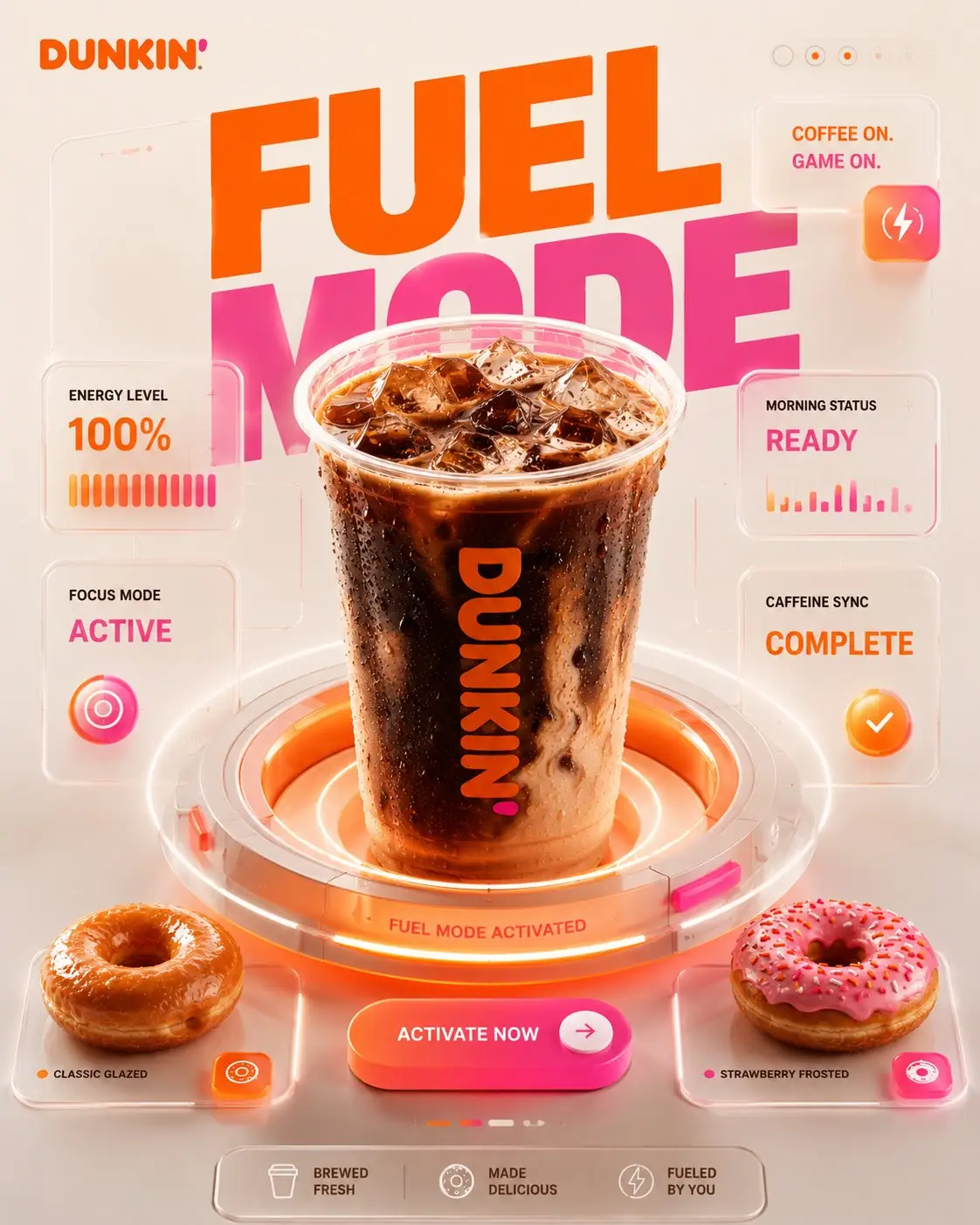
Create a 4:5 vertical premium social-media advertising poster for [coffee brand]. The final image must feel like a high-end 3D brand experience shaped by premium product marketing, restrained futuristic interface design, and luxury commercial CGI polish.
BRAND SYSTEM:
Anchor the entire poster in the color system of [coffee brand], using [primary brand color], [secondary accent color], warm cream neutrals, coffee-brown liquid depth, and soft-white interface highlights. Keep the visual language brand-owned and consistent.
BIG IDEA:
Build the image around the campaign statement [core campaign idea]. The drink is not presented like a normal menu item. It must feel like a branded command center, ritual engine, or operating system for the mood the campaign promises.
MASTER COMPOSITION:
Place one colossal iced coffee or cold beverage from [coffee brand] in the center, occupying roughly 70 to 75 percent of the composition. The cup rises out of a floating circular 3D interface ring that simultaneously feels like a dashboard, control dial, and premium product pedestal.
INTERFACE PANEL SYSTEM:
Surround the hero cup with floating translucent glassmorphism panels that show 3 to 5 concise status blocks such as [panel label 1], [panel label 2], [panel label 3], and [panel label 4]. Use rounded corners, soft transparency, subtle glow, realistic reflections, clean information hierarchy, and believable panel depth.
HERO PRODUCT:
Render the beverage with ultra-premium product-photography realism: intense condensation, visible ice-cube refractions, rich coffee swirls, accurate plastic or cup materials, and studio-quality highlights. Every surface should feel commercially finished, not illustrative or sketchy.
IDENTITY CONTROL:
Lock the same branded hero product identity across every variation. Keep one cup architecture, one lid-and-straw logic, one material language, and one reference lock for the hero beverage so the product likeness stays consistent even when colors, slogans, pastries, or campaign copy change. If you translate the poster to a different brand, preserve the same character of the system and only swap the protected brand cues.
SIDE PRODUCT SYSTEM:
Include only two side pastries or signature companion products associated with [coffee brand]. Integrate them as premium UI objects or pedestal details aligned to the same grid system. Do not let them float randomly or compete with the hero cup.
TYPOGRAPHY:
Use giant composition-integrated typography built from [mode label]. The large words must sit behind or around the cup with partial occlusion so the type feels designed into the environment instead of pasted on top. Add a short secondary line such as [secondary slogan] and one strong CTA button reading [cta text].
BACKGROUND:
Keep the background minimal and premium. Use soft cream space, large circular interface rings, controlled gradients, and clean negative space. The environment should feel restrained and product-launch ready, not busy or cluttered.
LIGHTING AND MATERIALS:
Use soft studio illumination, beautiful specular highlights, physically accurate reflections, premium CGI realism, and launch-event product lighting. The result should feel like a world-class FMCG hero visual rather than a casual cafe poster.
SCENE VARIATION LOGIC:
Treat each brand translation as a controlled scene variation, not a new composition. Different outputs can shift the campaign mood from energetic to calm, seasonal to evergreen, or loyalty-focused to launch-focused, but the central scene must still keep one colossal cup, one circular interface base, one giant headline zone, one CTA, and one disciplined panel hierarchy.
PRODUCTION FORMAT:
Render as a high-resolution 4:5 poster suitable for premium social ads, launch mockups, FMCG presentation boards, and campaign concept reviews. Keep the cup, interface ring, CTA, giant typography, and panels fully visible in one polished frame with clean hierarchy and readable negative space.
NEGATIVE PROMPT:
No random floating pastries. No messy cafe background. No extra drinks. No low-detail cup logos. No chaotic neon overload. No flat UI stickers with no depth. No tiny unreadable panel clutter. No broken ice geometry. No warped perspective on the cup. No generic restaurant-table scene.
SWAP LOGIC:
When you replace [coffee brand], keep the same one-cup hero, one circular interface base, one premium CTA, one giant mode headline, one controlled glass-panel system, and two aligned side products. Only swap brand colors, slogans, panel wording, and supporting pastry cues so the source layout logic remains intact.Why This Framework Functions
This framework works because it treats the drink like a branded interface instead of a normal product shot. The oversized cup creates instant focal clarity, the circular dashboard ring gives the layout a built-in stage, and the glassmorphism panels add campaign information without stealing the hero role. That hierarchy keeps the image commercial, futuristic, and readable even when the brand colors and copy system change.
Implementation Steps
- Lock the brand system first: Choose the coffee brand, its core mode label, and the exact two brand colors before you render, so the typography, interface glow, and CTA all belong to one visual family.
- Keep one hero drink only: The source works because one oversized iced cup dominates the frame. Do not split attention across extra beverages or a crowded tabletop scene.
- Limit the panels to real campaign signals: Use only a few status cards with readable labels and numbers. If you overfill the interface, the poster starts looking like fake UI noise instead of premium product marketing.
- Rebuild all protected brand details in post: Generated logos, legal copy, reward systems, and CTA microtext should be cleaned or replaced manually in Figma or Photoshop before any public or paid use.
- Use the root examples for translation, not expansion: Swap brand identity and pastry cues the way the source did across Dunkin, Starbucks, Tim Hortons, and Costa, but keep the same dashboard staging logic.
Application Scenarios
- Launch-day social hero visuals: Premium 4:5 assets for new iced drinks, seasonal menu drops, and campaign countdown posts.
- Loyalty and app-promo campaigns: Dashboard-style product art for rewards systems, app onboarding, points mechanics, and habit-building coffee campaigns.
- Agency pitch-deck concepts: High-fidelity speculative visuals for FMCG brand refreshes, SMM retainer proposals, and future-campaign mockups.
- Retail and in-store display prototypes: Branded poster concepts for digital menu boards, counter screens, and in-store teaser placements.
Why This Prompt Works
This prompt works because it merges three things that usually live apart: premium product photography, interface design language, and campaign typography. The cup behaves like a product hero, the panels behave like information architecture, and the giant mode words behave like branding structure. That combination gives the poster a strong commercial identity instead of reading like a random cafe render.
Troubleshooting & Optimization
- The poster feels cluttered: Reduce the panel count and append minimal premium dashboard, only essential interface cards, clean negative space.
- The cup loses hero scale: Append single colossal iced coffee occupying most of the frame, supporting elements clearly secondary.
- The pastries look random: Append two side products integrated into the same grid and pedestal system, no floating snack chaos.
- The image stops feeling premium: Reinforce glassmorphism panels, physically accurate reflections, product-launch lighting, luxury CGI realism.
- Brand details become unusable: Keep only major brand cues in the render and manually rebuild logos, slogans, and CTA microcopy after generation.
FAQ
- Q: What is a coffee advertising poster prompt used for?
A: It is used to create premium coffee-campaign visuals where one hero drink, dashboard-style interface panels, giant typography, and a polished CTA combine into a branded social or campaign poster. - Q: Can I swap the brand and keep the same layout?
A: Yes. The source already demonstrates that the same operating-system poster logic can translate across multiple coffeehouse brands if you only change colors, slogans, and supporting product cues. - Q: What still needs manual work after generation?
A: Real-brand logos, reward terminology, legal claims, UI microcopy, and any numbers or call-to-action labels should be rebuilt manually before the image moves into paid or public commercial use.
Use this prompt to generate your version? Share in the comments or on Twitter!
Explore more? View the Image & Design or Marketing & Growth category.
I hope you found this coffee advertising AI prompt helpful.
Follow me @bigprompt for more.
Like/Repost if you can this prompt.
World Cup Pass Prompt for Collectible National Tournament Posters
Passport City Diorama Prompt for Editorial Travel Posters
Miniature Match Worlds from a Football Stadium Map Diorama Prompt
Pop-Up Map Diorama Prompt for Folded Travel Worlds
Football Collectible Diorama Prompt for Museum-Style Player Boxes
Big Prompt Hub Review
This prompt is strongest when a coffee brand needs to feel like a premium operating system rather than a normal menu item. The hero cup, interface ring, giant mode typography, and glass dashboard panels create a clear campaign hierarchy that survives brand swaps well. Its main weakness is brand-specific fidelity: generated logos, reward terms, and interface microcopy can break fast or drift into protected territory. Use it for concept art, SMM campaigns, deck visuals, and art direction first, then manually rebuild every sensitive brand detail before release.
Leave a Reply
You must be logged in to post a comment.