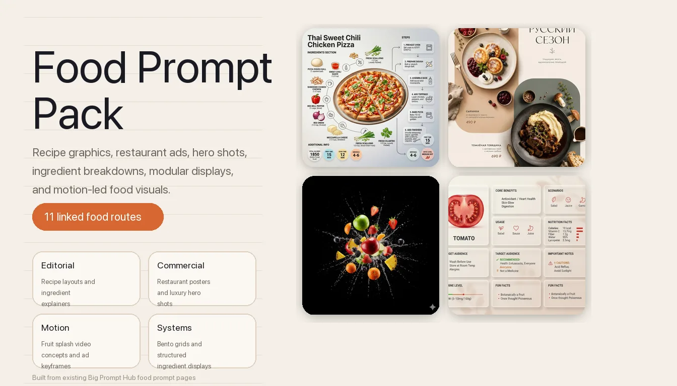
AI food prompts are most useful when you first separate the job: recipe explainer, restaurant poster, premium hero shot, ingredient breakdown, structured product layout, or motion-heavy commercial. This collection helps you choose the right route before committing to a full workflow.
Image Example

AI Food Prompts Overview
This page works best as a routing hub for visual food work. The collection spans editorial recipe layouts, restaurant advertising, hero-shot photography, ingredient explainers, stylized concept art, modular display systems, and one motion-first commercial branch, so you can choose the right prompt family before you start iterating.
- Prompt 1: Recipe infographic layouts for editorial food explainers and cooking-step visuals.
- Prompt 2: Restaurant advertising posters with menu zones, dish hierarchy, and launch-ready branding.
- Prompt 3: Food hero explainer posters that combine premium plating with ingredient logic.
- Prompt 4: Minimalist origami food art for geometric paper-driven concept visuals.
- Prompt 5: Fruit-splash food commercial setups for motion-first beverage and produce ads.
- Prompt 6: Food country dioramas that turn national dishes into educational map-like scenes.
- Prompt 7: Labeled ingredient breakdown photography for menus, ads, and editorials.
- Prompt 8: Luxury hero shots for high-end menu visuals and premium dish campaigns.
- Prompt 9: Cinematic country food photography for speed, splash, and luxury advertising energy.
- Prompt 10: Bento-grid product display systems for structured ingredient and product layouts.
- Prompt 11: Medicine-box ingredient displays for orderly, conceptual food storytelling.
Strategic Deployment Guide
Model fit: GPT Image 2 is the safest starting point across these AI food prompts when you need layout discipline, labeled zones, and cleaner poster structure; Nano Banana is strongest for stylized concept routes, while image-to-video stacks matter most for the fruit-splash commercial branch. Start with the communication job first, then open the linked standalone article for the full prompt logic and troubleshooting.
Prompt 1: Recipe Infographic Template
- Target: Editorial teams, food publishers, and educators building step-by-step recipe visuals.
- Input: Finished dish, ingredient groups, cooking stages, label hierarchy, and layout ratio.
- Model fit: ChatGPT and Gemini for structured infographic composition with clearer information zones.
- Expected output: A recipe graphic that keeps the dish, ingredients, and process blocks visually separated.
- Quality check: The layout should read like an editorial recipe page, not a random collage of food objects and labels.
Ultra-clean modern recipe infographic.

Showcase "[Dish Name]" in a visually appealing finished form—sliced, plated, or portioned—floating slightly in perspective or angled view.

Arrange ingredients, steps, and tips around the dish in a dynamic editorial layout, not restricted to top-down.

Ingredients Section:
Include icons or mini illustrations for each ingredient with quantities.
Arrange them in clusters, lists, or circular flows connected visually to the dish.

Steps Section:
Show preparation steps with numbered panels, arrows, or lines, forming a logical flow around the main dish.
Include small cooking icons (knife, pan, oven, timer) where helpful.

Additional Info (optional):
Total calories, prep/cook time, servings, spice level—displayed as clean bubbles or badges near the dish.

Visual Style:
Editorial infographic meets lifestyle food photography.
Vibrant, natural food colors, subtle drop shadows, clean vector icons, modern typography, soft gradients or glassmorphism for step panels.
Accent colors can highlight key info, such as calories and prep time.

Composition Guidelines:
Finished meal as hero visual, in perspective or angled view.
Ingredients and steps flow dynamically around the dish.
Clear visual hierarchy:
dish > steps > ingredients > optional stats.
Enough negative space to keep the design airy and readable.

Lighting & Background:
Soft, natural studio lighting.
Minimal textured or gradient background for premium editorial feel.

Output:
1080×1080.
Ultra-crisp.
Social-feed optimized.
No watermark.
Use the full page when the food image must teach as well as attract. It is the strongest branch in this collection for cookbook cards, social recipe explainers, and menu education assets.
Open the full Prompt 1 article.
Prompt 2: Food Advertising Poster
- Target: Restaurant teams, cafe brands, and hospitality designers creating launch ads or menu posters.
- Input: Cuisine, dish set, menu language, prices, palette, typography zones, and brand tone.
- Model fit: ChatGPT/GPT Image 2 first for stable layout control and cleaner poster spacing.
- Expected output: A vertical restaurant poster with overhead dishes, readable menu structure, and branded negative space.
- Quality check: Dish hierarchy and text zones must stay readable before any manual typography cleanup.
POSTER FORMAT AND COMPOSITION:
Create a minimal commercial food advertising poster for [restaurant cuisine] in a modern [regional design style] style with [layout influence] layout aesthetics.

Use a pure vertical [poster ratio] composition. Preserve a clear diagonal structure with two large rounded vertical geometric color blocks. Place one block in the upper-left field and one block in the lower-right field, leaving airy negative space for menu text, price labels, and small brand marks.

SUBJECT AND DISH IDENTITY CONTROL:
The upper-left block is the first hero dish: [hero dish one], photographed from above on [dish one plate style]. Keep the dish recognizable, appetizing, and cleanly separated from the background.

The lower-right block is the second hero dish: [hero dish two], photographed from above on [dish two plate style]. Maintain clear ingredient identity, visible sauce texture, and a different plate color or value from the first dish.

SCENE AND PROP LOGIC:
Arrange [supporting props] around the two dishes as small editorial accents. Keep props aligned to the diagonal reading path instead of scattering them randomly. Use only objects that match [restaurant cuisine] and the commercial menu concept.

TYPOGRAPHY AND MENU INFORMATION:
Place large restaurant typography in the upper-right negative space. Use [menu language] for all visible menu text. Include [restaurant name], [dish names], and [prices]. Keep small price labels close to the matching dish, with readable spacing and no text crossing over food.

COLOR, LIGHTING, AND BRAND STYLE:
Use [color palette] with soft commercial shadows, overhead food photography, refined menu spacing, and modern restaurant branding. Keep the poster minimal, editorial, and print-aware. Add a subtle footer signature or small brand mark using [footer signature].

PRODUCTION FORMAT:
Generate a high-resolution vertical poster suitable for restaurant campaign mockups, social media teasers, menu preview pages, and print layout exploration. Keep edges clean, ingredients realistic, and the composition easy to rebuild in Figma, Photoshop, Illustrator, or another design tool.

NEGATIVE PROMPT:
Avoid messy prop scattering, unreadable menu text, extra plates, duplicated dishes, warped utensils, random cuisine objects, heavy 3D type, neon gradients, cluttered stickers, distorted prices, broken letters, cropped hero dishes, greasy lighting, and poster layouts that ignore the two rounded color blocks.
Open this route when the page job is selling the restaurant, not just showing a dish. It works best for launch weeks, set menus, cafe promos, and quick visual mockups for hospitality campaigns.
Open the full Prompt 2 article.
Prompt 3: Food Hero Explainer Poster
- Target: Culinary marketers and commercial photographers who need one dish to look premium and informative at the same time.
- Input: Hero dish, ingredient callouts, plating logic, lighting style, and explainer layout direction.
- Model fit: ChatGPT/GPT Image 2 for cinematic food surfaces and structured ingredient logic.
- Expected output: A premium poster that combines hero-shot appetite appeal with readable ingredient explanation.
- Quality check: The ingredient logic should support the hero dish instead of competing with it for visual focus.
## Task
Generate a premium vertical (2:3) food advertising poster based on the uploaded dish image.
Style: modern, clean, high-end, commercial food branding.

---

## Core Constraint (CRITICAL)
- Preserve the original dish EXACTLY (type, structure, plating, color, texture)
- Only enhance lighting, sharpness, depth, and commercial quality
- Do NOT alter or replace the food

---

## Layout Structure

### 1. Brand Header
- Logo: [Brand Logo Style]
- Brand Name: [Brand Name]
- Slogan: [Brand Slogan]
- Divider: minimal thin line

---

### 2. Product Title
- Text: [Product Name]
- Style: large, bold, centered
- Color: near-black / dark brown
- Accent: [Accent Color]

---

### 3. Hero Food Visual
- Use uploaded image as main subject
- Enhance to premium food photography quality
- Optional garnish: [Optional Garnish Elements]

---

### 4. Left Panel — INGREDIENTS
Title: INGREDIENTS

Items (4–6):
- [Ingredient 1] — [Short Description]
- [Ingredient 2] — [Short Description]
- [Ingredient 3] — [Short Description]
- [Ingredient 4] — [Short Description]
- [Ingredient 5] — [Short Description]
- [Ingredient 6] — [Short Description]

---

### 5. Right Panel — PRODUCT BENEFITS
Title: PRODUCT BENEFITS

Items (4–5):
- [Benefit 1] — [Short Description]
- [Benefit 2] — [Short Description]
- [Benefit 3] — [Short Description]
- [Benefit 4] — [Short Description]
- [Benefit 5] — [Short Description]

---

### 6. Bottom Conversion Area
- Label: PRICE
- Price: [Price]
- Currency: [Currency Symbol]
- Unit: [Unit] (e.g. PER SERVING / PER BOWL)
- CTA Button: [CTA Text] (e.g. ORDER NOW / BUY NOW)

---

### 7. Bottom Social Section
Line 1: [CTA Line]
(e.g. Discover more · New arrivals · Limited offers)

Line 2: Platform icons only:
[Platform 1] + [Platform 2] + [Platform 3] + [Platform 4]
(e.g. Instagram / TikTok / YouTube / Facebook)

Line 3:
[Search Hint]
(e.g. @BrandName or Search: BrandName)

---

## Visual Style
- Background: warm white / cream / beige
- Clean, minimal layout
- Whitespace ≥ 50%

---

## Color System
- Primary text: dark brown / near black
- Accent color: [Accent Color]
- Food = visual focus

---

## Quality Standard
- Realistic
- Appetizing
- Commercial lighting
- Polished finish

---

## Strict Restrictions
- No food alteration
- No clutter
- No cheap flyer style
- No inconsistent icons
- No AI-looking food
This page is the right choice when you want something richer than a plain ad and more glamorous than a basic labeled diagram. It sits between food advertising and ingredient education.
Open the full Prompt 3 article.
Prompt 4: Minimalist Origami Food Art
- Target: Designers exploring conceptual food art, poster experiments, and stylized campaign imagery.
- Input: Food object, paper geometry style, fold complexity, background tone, and composition restraint.
- Model fit: Gemini and Midjourney-style image models for stylized material and geometric paper logic.
- Expected output: A paper-crafted food visual with deliberate folding logic rather than literal food photography.
- Quality check: The result should still read as the chosen food while keeping the origami construction believable.
A hyper-detailed origami [FOOD] folded from realistic colored paper with visible creases and paper texture. Complex geometric folds capture the food’s shape, layers, and distinctive features. Placed on clean surface with soft shadows, minimalist food art photography style. 1080x1080 squareChoose this branch when realism is not the goal. It is strongest for editorial concept covers, gallery-style graphics, and brand work that wants abstraction instead of appetizing literalism.
Open the full Prompt 4 article.
Prompt 5: Fruit Splash Food Commercial Video
- Target: Beverage marketers, produce brands, and short-form ad teams building motion-first food commercials.
- Input: Fruit type, liquid behavior, camera energy, lighting, keyframe brief, and final motion intent.
- Model fit: Still-image prompt plus image-to-video workflow for liquid physics and fruit explosion motion.
- Expected output: A high-speed commercial visual system built around splash, fragmentation, and frozen-motion energy.
- Quality check: The still keyframe must already communicate believable fruit trajectory and liquid force before motion generation starts.
A stunning hyper-realistic arrangement of fresh fruits, including red and green apples, strawberries, oranges, grapes, blackberries, and pineapples, exploding outward with vibrant juice splashes and dynamic motion. Ultra high-definition, extreme sharpness, cinematic lighting with dramatic contrast, rich vivid colors, floating and overlapping fruits, fine textures on fruit surfaces, droplets and splashes frozen in mid-air, luxury food photography style, highly detailed, black background, negative space, visually striking composition, hyper-realistic rendering, ultra-detailed photorealism.This is the motion branch of the collection. Use it when the job is not a static poster but a beverage ad, produce commercial, or short looping social spot that needs impact in the first second.
Open the full Prompt 5 article.
Prompt 6: Food Country Diorama
- Target: Educational creators, geography storytellers, and culture-led food visual teams.
- Input: Country, signature dishes, geographic context, ingredient identity, and miniature scene framing.
- Model fit: ChatGPT or similar image models for miniature-scene structure and readable national-food identity.
- Expected output: A food-based country diorama that teaches geography through dish identity and scene composition.
- Quality check: The country cue and the food cue must reinforce each other instead of looking like two unrelated ideas pasted together.
Do this for Continent: <instructions>
Input = Country

Act as a world class visual artist and geography expert. For every continent find 4 less known countries and the dishes that are very popular there. Do research to get this step right.

Function Draw ($ Country) {
> **Anchor:** `[Iran]::4`
> **Morphology:** `3D Typography spelling "[Country Name]", miniature diorama, edible landscape, food styling, topographic food map::3`
> **Material Physics:** `[Country Name] national gastronomy, iconic culinary textures, native ingredients palette, authentic cuisine aesthetics::3`
> **Illumination:** `Gastropub lighting, studio food photography, appetizing gloss::2`
> **Render Stack:** `Macro lens, 8k, depth of field, Michelin plating style::1`
> **Negative:** `[Inedible, plastic, raw, rotting, people, plates, cutlery]:: -1`
}

Output: 2x2 grid, for each panel execute Draw Function for one of the countries plus the name of the dish. Name of the country underneath
</instructions>
Use this route when the food image needs a narrative or educational spine. It is more about cultural mapping and worldbuilding than menu photography.
Open the full Prompt 6 article.
Prompt 7: Labeled Food Photography
- Target: Food brands, menu designers, and editorial teams needing clean ingredient explanation visuals.
- Input: Dish, ingredient set, callout labels, layout spacing, surface styling, and clarity constraints.
- Model fit: ChatGPT/GPT Image 2 for orderly ingredient placement and cleaner labeled composition.
- Expected output: A labeled food image that keeps explanation, freshness, and ad-ready polish in balance.
- Quality check: Labels should clarify the dish structure without turning the image into a cluttered diagram.
{
  "global_settings": {
    "resolution": "8K ultra high definition",
    "aspect_ratio": "3:4",
    "camera_style": "studio food photography with cinematic lighting",
    "depth_of_field": "shallow depth of field, sharp subject, soft background",
    "lighting": "soft directional key light, subtle rim light, controlled highlights",
    "style": "hyper-realistic food illustration with editorial infographic overlays",
    "composition_rules": [
      "no zoom",
      "no crop",
      "center-weighted vertical composition",
      "floating elements frozen in motion"
    ],
    "text_design": {
      "ingredient_name_color": "metallic gold",
      "ingredient_description_color": "pure white",
      "font_style": "elegant serif for titles, clean sans-serif for descriptions",
      "indicator_lines": "long, thin, smooth golden lines with rounded corners"
    }
  },

  "module_1_image_1_style": {
    "scene_description": "A vertical stack of assorted cake slices floating above a white ceramic plate against a soft pink gradient background.",
    "background": {
      "color": "soft pastel pink",
      "texture": "smooth gradient",
      "lighting": "even, studio-lit, no harsh shadows"
    },
    "main_subjects": [
      "multiple layered sponge cake slices",
      "white whipped cream layers",
      "raspberry cream layer",
      "chocolate cream topping"
    ],
    "visible_ingredients": [
      "vanilla sponge cake",
      "whipped cream",
      "raspberries",
      "blueberries",
      "strawberry",
      "macarons (vanilla and chocolate)",
      "chocolate bar pieces",
      "mint leaves",
      "small nut fragments"
    ],
    "motion_elements": [
      "floating fruits",
      "floating macarons",
      "crumbs suspended in air"
    ],
    "text_labels": [
      "Vanilla Cake – soft, fluffy sponge cake layered with white cream filling",
      "Macaron – creamy filling between almond meringue shells",
      "Raspberries – juicy, fresh raspberries",
      "Chocolate Bar – chunks of smooth milk chocolate",
      "Raspberry Cream – soft sponge cake layered with creamy, fruity raspberry cream"
    ]
  },

  "module_2_image_2_style": {
    "scene_description": "Rolled Syrian dessert presented vertically with syrup pouring from above, placed in a warm, rustic kitchen environment.",
    "background": {
      "environment": "traditional kitchen",
      "elements": [
        "warm lantern light",
        "wooden surfaces",
        "brass and copper utensils"
      ],
      "lighting": "warm ambient lighting with soft highlights"
    },
    "main_subjects": [
      "rolled white dessert dough",
      "cream filling spilling out",
      "golden syrup stream"
    ],
    "visible_ingredients": [
      "white cheese dough",
      "cream filling",
      "pistachios",
      "sugar syrup"
    ],
    "motion_elements": [
      "syrup dripping vertically",
      "pistachio crumbs falling"
    ],
    "text_labels": [
      "White Cheese Dough – soft outer layer made from cheese and semolina",
      "Cream Filling – creamy filling inside the roll",
      "Pistachios – crushed pistachios sprinkled over and inside the rolls"
    ]
  }
}
This is the clearest branch when the viewer needs to understand what is inside the dish immediately. It suits ingredient-led ads, menu explainers, food education, and product storytelling.
Open the full Prompt 7 article.
Prompt 8: Luxury Food Hero Shot
- Target: Premium menu brands, hospitality campaigns, and teams selling one dish as a luxury object.
- Input: Hero dish, levitation or stacked composition cues, lighting treatment, garnish control, and background mood.
- Model fit: ChatGPT and luxury-photography-friendly image models for texture, stacking, and ad polish.
- Expected output: A premium hero image that makes the dish feel campaign-ready rather than merely documentary.
- Quality check: The composition must stay elegant and appetite-led without turning into a chaotic pile of floating garnish.
[FOOD NAME], premium food advertising photography on a white seamless background.

High-key studio lighting with soft directional highlights emphasizing form, texture, and freshness.

Floating, stacked composition with subtle levitation for dynamic depth, creating a clean, modern hero shot.

Ingredients and natural garnishes associated with [FOOD NAME] gently suspended mid-air, minimal and intentional.

Clean, minimalist layout with strong visual focus on the hero product.

Crisp yet soft contact shadow grounding the composition.

Ultra-realistic macro product photography look, 100mm lens aesthetic, f/8 aperture for full sharp focus.

Subtle surface textures and natural imperfections clearly visible.

Editorial-grade commercial styling, luxury food branding aesthetic.
Photorealistic, 8K ultra-high resolution.
Go here when the food itself is the brand centerpiece. This is the strongest path for hero banners, menu covers, launch ads, and luxury food campaign mockups.
Open the full Prompt 8 article.
Prompt 9: Cinematic Country Food Photography
- Target: Advertisers and creators who need dramatic splash, speed, and national-dish identity in one visual.
- Input: Country dish, lighting speed, splash or action energy, background environment, and luxury ad tone.
- Model fit: Cinematic food-photography workflows with strong lighting and motion detail control.
- Expected output: A dramatic country-food advertisement with high-speed energy and polished culinary styling.
- Quality check: The national-dish identity should stay obvious even when the scene gets more dynamic and theatrical.
Ultra-high-quality, hyper-realistic commercial food photography of [COUNTRY FOOD NAME], rendered in 8K detail with a (4:3 or 3:4) aspect ratio.

The food is shown in multiple premium visual variations, each highlighting texture, layers, and freshness in a cinematic way.

Food details:
– Authentic [COUNTRY] cuisine presentation
– Clearly visible layers, fillings, or structure specific to [FOOD TYPE]
– Rich, natural colors and realistic textures

Motion & drama:
– Subtle mid-air elements (crumbs, ingredients, sauce, or spices)
– Natural gravity realism, frozen motion
– No mess, clean and controlled composition

Lighting & camera:
– Controlled studio lighting emphasizing texture and shine
– High-speed photography look
– Shallow to medium depth of field

Background:
– Solid or soft gradient background in [BACKGROUND COLOR]
– Clean, seamless, distraction-free

Style & finish:
– Luxury food advertising aesthetic
– Rich contrast, warm natural tones
– Ultra-sharp focus, no artificial glow

Negative prompt:
Text, logos, branding, hands, people, utensils, plates, tables, cartoon style, burnt food, overexposure, low-detail textures, artificial shine.
This branch is for teams who want the food image to feel expensive and kinetic at the same time. It sits closer to luxury advertising than to editorial menu explanation.
Open the full Prompt 9 article.
Prompt 10: Bento Grid Product Display
- Target: Designers who need orderly ingredient or product systems rather than one hero dish.
- Input: Ingredient set, object count, material styling, grid spacing, acrylic or glass cues, and display logic.
- Model fit: ChatGPT or other layout-disciplined image models for repeated modular structure.
- Expected output: A structured bento-grid display that turns ingredients or products into a calm visual system.
- Quality check: The spacing and material contrast must feel intentional, not like random boxes dropped around the frame.
Modern Bento Grid Product Layout, featuring a Frosted Acrylic and Translucent Glass aesthetic.
Subject: [Product Name - e.g., Tomato / AirPods Max / Aspirin]

【LAYOUT STRUCTURE】
8 non-symmetrical modules, landscape 16:9 format:

1. MODULE 1 (HERO): 3D translucent glass sculpture of [Product Name]. Label beneath: "[English Name]" in clean typography.
2. MODULE 2 (BENEFITS): Title "CORE BENEFITS". Content: 4 selling points separated by "/" (e.g., "Antioxidant / Heart Health / Skin Glow / Digestion").
3. MODULE 3 (USAGE): Title "HOW TO USE" or "SCENARIOS". Content: 4 usage methods.
4. MODULE 4 (SPECS): Title "TECH SPECS" or "NUTRITION". Content: 5 data points with units (mg, kcal, etc.).
5. MODULE 5 (USERS): Title "TARGET AUDIENCE". Content: Recommended (✓) and Cautions (!!) sections.
6. MODULE 6 (NOTES): Title "IMPORTANT NOTES". Content: 4 critical reminders.
7. MODULE 7 (INDICATOR): Title based on type (e.g., "Purine Level" or "Compatibility").
8. MODULE 8 (INSIGHTS): Title "FUN FACTS". Content: 2-3 interesting insights.

【MATERIAL SPECS - CRITICAL】
- Translucency: 80-85% semi-transparent frosted cards. Background must be visible through cards.
- Material: Frosted glass blur, backdrop-filter style, with micro-glow on borders.
- Physics: Realistic glass refraction, surface reflections, and soft floating shadows.

【LANGUAGE & TYPOGRAPHY】
- LANGUAGE: ALL TEXT MUST BE IN ENGLISH ONLY. No Chinese characters.
- Text Color: Deep Charcoal (#3A3A3A) for high readability on glass.
- Fonts: Bold headers, regular body text, bold numeric data.

【COLOR & BACKGROUND】
- Palette: 90% Neutral (Cream/White/Glass) + 10% [Product Theme Color] accents for icons/data.
- Background: Soft 3-color gradient with abstract shapes visible through acrylic cards.

QUALITY: 8k resolution, professional Octane/C4D render, minimalist line icons, photorealistic textures.
Choose this route when the job is about comparison, taxonomy, ingredients, or category framing. It works especially well for editorial product spreads and modular ingredient storytelling.
Open the full Prompt 10 article.
Prompt 11: Medicine-Box Ingredient Display
- Target: Conceptual food storytellers and brands that want ingredients to feel precise, orderly, and unexpected.
- Input: Ingredient list, compartment logic, packaging rhythm, background neutrality, and object order.
- Model fit: Image models that handle symmetry, object separation, and product-shot cleanliness.
- Expected output: A compartmentalized ingredient display that makes raw food feel designed rather than casual.
- Quality check: The box logic should stay crisp enough that every ingredient feels intentionally placed and individually legible.
<instruction>
1. Analyze Input Variable:
Input A is a precision-crafted cuisine (e.g., Sushi, French Patisserie, Dim Sum).
Deconstruct Input A into 5–7 distinct components (e.g., Shari rice, Neta fish slices, Nori sheets, Wasabi, Ginger).
Constraint: Ingredients must be raw, fresh, and neatly organized by type.

2. The "Immutable" Container (The Rig):
Goal: A "catchy name for fo" Lab Kit.
Material: Crystal-clear, thin-walled acrylic organizer box.
Configuration: Crucial: The lid of the box is attached and hinged open at a 90-degree angle, standing vertically behind the compartments.
Layout: Internal dividers creating a grid of 4–6 sections. One central section is flat/open for assembly.

3. Visual Syntax & Graphics (Scientific Overlay):
Graphic Style: Black line-art Chemical Skeletal Formulas (hexagonal molecular structures). Placement Z: draw a timeline of this food from where it started with its name above the open lid.
Placement A: Printed clearly on the vertical open lid, directly above the corresponding ingredients in the box.
Placement B: Printed on the white table surface directly in front of the box.
Typography: Minimalist, lowercase sans-serif labels (e.g., "rice," "ginger") next to the molecules.

4. The Narrative Figure (The Integrated Scale):
Character: A tiny 1:35 scale chef (appropriate uniform for the cuisine).
Position:INSIDE the central compartment of the box.
Action: The figure is actively constructing the final version of Input A using the giant ingredients surrounding them (e.g., rolling a sushi roll that is waist-high to the figure).

5. Lighting & Environment:
Background: A blurred, high-end white minimalist kitchen (hint of a chrome faucet or ceramic tiles in the distance).
Lighting Style: High-Key Clinical. Bright, diffuse daylight. Minimal shadows. "Apple Product Photography" aesthetic.
Color Palette: White, Grey, Clear, punctuated by the vibrant natural colors of the food.

Output: ONE image, 1:1 Aspect Ratio, Macro Photography, High-Key exposure, Clean and Sterile aesthetic.
</instruction>
This page is best when you want food ingredients to read like collectible objects or premium packaging components. It is less about appetite and more about systemized visual novelty.
Open the full Prompt 11 article.
Selection Logic
Use Prompt 1 or 7 when clarity and explanation matter most, Prompt 2 or 8 when the goal is direct selling power, Prompt 3 when you need premium storytelling plus structure, Prompt 4 for stylized concept art, Prompt 5 for motion-first beverage or produce campaigns, Prompt 6 for educational cultural storytelling, and Prompt 10 or 11 when the food needs to read as a modular display system rather than a plated scene. Prompt 9 is the high-drama advertising branch when luxury and action both matter.
Implementation Steps
- Choose the communication job first: Decide whether the page needs to educate, sell, dramatize, stylize, or organize ingredients before you open any prompt.
- Match the prompt to the asset format: Posters, recipe graphics, hero shots, grid systems, and video keyframes should not share the same layout assumptions.
- Lock food identity early: Confirm dish, cuisine, ingredient set, plating level, and brand tone before tuning lighting or typography.
- Use the linked page for full execution: Once the route is clear, open the underlying article and apply its full prompt logic, model notes, and troubleshooting guidance.
- Polish generated text and labels manually: Treat menus, price blocks, ingredient callouts, and commercial typography as layout guides first, then finish them in design tools.
Use Cases
- Casual restaurant summer rollout: A multi-location brunch chain uses Prompt 2 for storefront posters, Prompt 8 for delivery-app hero images, and Prompt 7 for Instagram ingredient carousel panels during a six-week menu launch.
- Editorial recipe package: A food publisher pairs Prompt 1 for the recipe card layout with Prompt 3 for the article lead image, then exports both into newsletter headers, Pinterest recipe pins, and on-site story modules.
- Paid beverage launch campaign: A sparkling-water brand uses Prompt 5 for six-second splash video loops and Prompt 9 for Meta and TikTok still ads that need premium speed, liquid force, and national-fruit identity.
- Conceptual food portfolio deck: A packaging designer combines Prompt 4, Prompt 10, and Prompt 11 to create Behance case-study covers, gallery pitch boards, and modular ingredient spreads for a personal portfolio refresh.
Why These Prompts Work
These prompts work as a collection because they do not all try to solve “food visuals” with one vague instruction. Each page fixes a different visual job: explanation, menu selling, hero-shot appetite, concept stylization, motion energy, educational mapping, or modular ingredient order. That separation keeps the user from forcing one food prompt into the wrong asset type and improves both generation quality and downstream design cleanup.
Troubleshooting & Optimization
- The page choice feels fuzzy: Decide whether the output is primarily a poster, a hero shot, an explainer, a grid system, or a video keyframe before adjusting visual style.
- The food looks generic: Replace broad dish wording with cuisine, ingredient structure, plating cues, and one clear brand or editorial context.
- The result is beautiful but unusable: Shift toward the layout-sensitive branches such as Prompt 1, 2, 7, or 10 when the asset needs text zones, labels, or structural order.
- The motion concept lacks force: For Prompt 5, refine the still keyframe first with trajectory, splash direction, and lighting logic before moving into video generation.
FAQ
- Q: What are AI food prompts best used for?
A: They are best used when you know the brief is visual food work, but you still need to decide whether the job is recipe education, restaurant selling, hero-shot photography, ingredient explanation, conceptual art, modular display, or motion advertising. - Q: Why include a direct article link under each prompt instead of duplicating every prompt here?
A: Because the standalone pages already contain the deeper execution logic, examples, and troubleshooting. This hub is meant to shorten the selection step, not create one bloated duplicate page. - Q: Which prompt should I start with for restaurant marketing?
A: Start with Prompt 2 for poster-led selling, Prompt 8 for luxury hero shots, and Prompt 7 when ingredient clarity or menu education needs to support the campaign. - Q: Which prompt is strongest for non-photographic food visuals?
A: Prompt 4 is the stylized paper-art branch, while Prompt 10 and Prompt 11 are stronger when you want modular display logic rather than traditional plated photography.
Need adjacent prompt systems? Pair this collection with the Claude Design Prompts pack when the food visuals also need packaging systems or campaign assets, then browse the Image & Design archive for more format-specific visual prompts.
Use this page as the routing layer, then open the linked standalone article that matches the exact food-visual job before you generate.
Explore more? View the Image & Design or Prompt Engineering Guides category.
I hope you found this collection helpful.
Follow me @bigprompt for more.
Like/Repost if you can this prompt.
Internal link:
Claude Design Prompts for Systems, UI, and Marketing Assets
World Cup Country Poster Prompt for Luxury National Campaigns
Coffee Advertising Poster Prompt for Futuristic Brand Dashboard Campaigns
World Cup Pass Prompt for Collectible National Tournament Posters
Passport City Diorama Prompt for Editorial Travel Posters
Big Prompt Hub Review
This page is strongest as a food-visual routing layer, not as a replacement for all eleven standalone prompt articles. Its value is that it helps users quickly choose between recipe graphics, menu posters, labeled ingredient explainers, luxury hero shots, stylized concept art, grid displays, and motion commercials without guessing which page to open first. The tradeoff is deliberate compression: once the route is chosen, the user should continue into the linked page for the deeper prompt logic and examples.
Leave a Reply
You must be logged in to post a comment.